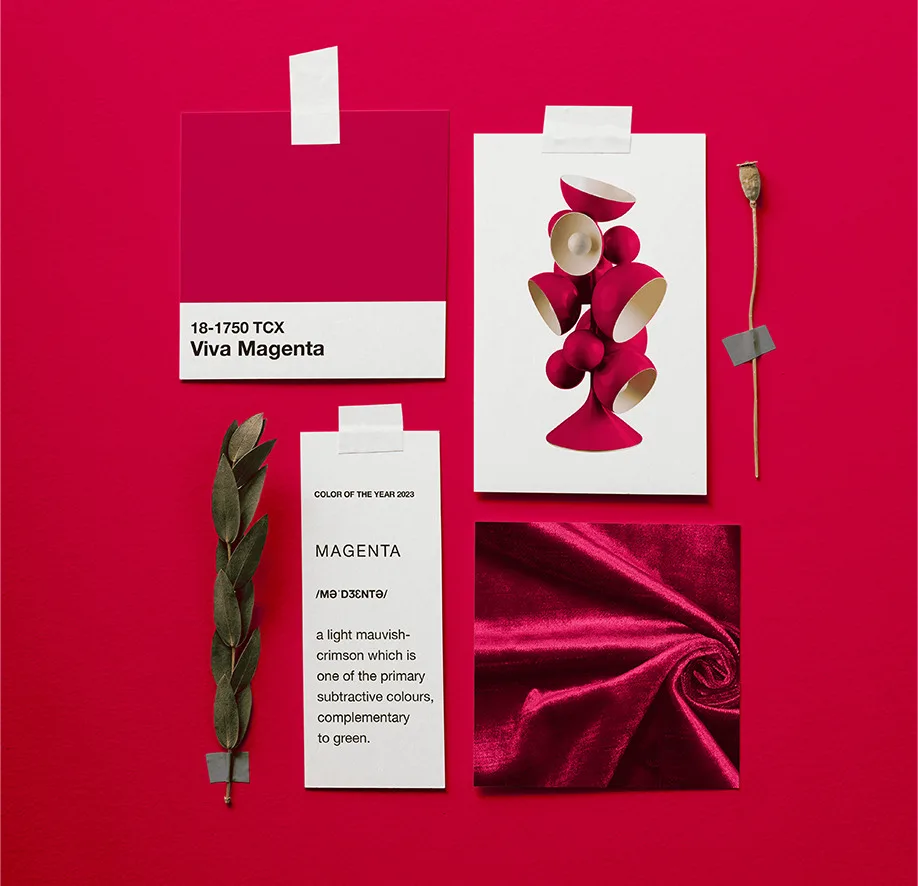
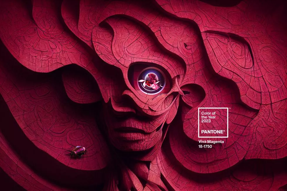
Viva Magenta is the Pantone color of the year 2023. Discover everything about the new trend shade in this article.
Besides the festive atmosphere that fulfills the end of the year, this is also the season to anticipate upcoming trends. As it has been in the past years, Pantone Color Institute contributed to the following trends and presented the Pantone color of the year: Viva Magenta, an unconventional shade for an unconventional time.
Pantone 18-1750 Viva Magenta is a subtle red, bold but not aggressive; a hue that goes to the encounter of the maximalist trends of the year and provides feelings of joy, optimism, and fearlessness to write the best narratives in 2023. Read on to discover more about the color of the year.
WHAT IS PANTONE COLOR OF THE YEAR?
The Pantone color of the year is an amazing clue for what will trend in the following year because the selection process is not arbitrary. Choosing the Color of the Year takes careful study and trend analysis.
The choice suggests an examination of the media, entertainment, and music industries, contemporary visual and digital artists, all fields of design, and new social and economic trends.
Since it was introduced in 2000, Pantone’s Color of the Year has affected the creation of goods and consumer choices across various markets, including fashion, home furnishings, industrial design, and graphic design.
The Pantone color of the year follows the trends and helps to anticipate what we should expect for the upcoming year; it´s a wonderful way to update yourself and your projects to new tendencies.
Now that you know how Pantone chose the color of the year keep reading to discover more about the Pantone color of 2023 and have some clues about the following trends.
A NEW VISION FOR 2023
Viva Magenta promises to bring a new vision for 2023, as the Pantone Color Institute described, “an unconventional shade for an unconventional time, a new vision for 2023”. A color based in nature that descends from the red family vibrates with energy and demonstrates a new signal of strength.
The choice of this vibrant hue as the year’s color goes to the encounter of the maximalist tendencies and the metaverse trends. Such as in the last year, when Pantone Color Institute presented the Very Peri as the color of 2022 because of its relation with Gen Z and technological trends, Viva Magenta also aims to explore the dynamic between Artificial Intelligence and human creativity.
But unlike the Very Peri, the Viva Magenta goes beyond the metaverse and its relation with technology; its represents a balance between nature and technology, warm and cool, physical and virtual, evoking a multi-dimensional world that the Pantone Color Institute called “the Magentaverse”.
Viva Magenta creates a fresh tale. A pulsing color whose enthusiasm fosters hope and excitement, bold and courageous. It is a strong, empowering red that encourages experimentation and uninhibited self-expression. It is a boundary-pushing hue that is obviously “out there” and makes a bold statement. PANTONE 18-1750 Viva Magenta is audacious, funny, and perfect to create a more positive future.
We all agree that Viva Magenta is an assertive shade for the upcoming year! But this brave hue also teaches us some tendencies that will brighten up the upcoming year. Read on to discover what we can learn from this unconventional shade.
THE INTERIORS TRENDS – LEARNING FROM VIVA MAGENTA
Pantone 18-1750 Viva Magenta aims to encourage the rebellious spirit in 2023; it´s a color that can make a statement wherever it goes – from interiors to the fashion world. Regarding the interiors, we have much to learn with this vibrant color; it´s why we have selected some tendencies that the Viva Magenta highlights in interiors:
- MAXIMALIST INTERIORS
More than going bold, the maximalist style represents a creative way of designing that allows travel into fantasy and dreams. The last years showed that the home is not just a space but a refuge. The maximalist interior trends aim to evoke the house as a space to free creativity and explore personality and identities, such as the Viva Magenta, which evokes creativity.
- NATURE INSPIRED
Despite the technology and virtual experiences, the following year also highlights a balance between nature and technology. Interior design is blending nature materials in modern layouts, getting green, and showing that it´s possible to find a balance between these two different spheres. Viva Magenta is a color that represents it; this hue can be easily found in nature and also remains in the virtual world.
- METAVERSE INTERIORS
The Pantone 18-1750 Viva Magenta highlights a dynamic between Artificial Intelligence and human creativity, which is always more present in the interior design world. All spheres of the physical world are being challenged by the digital world. The metaverse offers limitless opportunities for possession, creation, and human interaction. The metaverse interiors can extend the design experience beyond the real world and inspire homes worldwide. Unlimited ideas for bold interiors.
VIVA MAGENTA IN INTERIORS
Now that the presentations are done, it´s time for some inspiration – we selected some ideas that highlight red hues to inspire you to use the Viva Magenta in your upcoming projects:
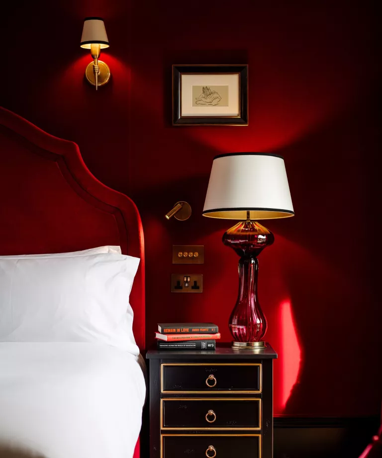
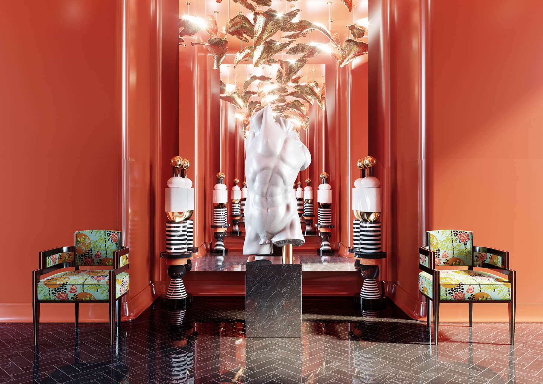
1. Make a statement
The Viva Magenta is a bright color and an excellent choice to make a statement in a room. A good idea to make a statament with the new trend color is by pairing the wall colors to the furnniture and acessories, such as in this bold bedroom. Remember, Viva Magenta is here to explore the imagination, so a bit of boldness while using this color is also a reasonable ask.
2. Use it as background
In Maximalist interiors, Viva Magenta can be an excellent complementation for furniture and home accessories. The red tone covers the walls in this stunning layout and is the perfect background for a home narrative.
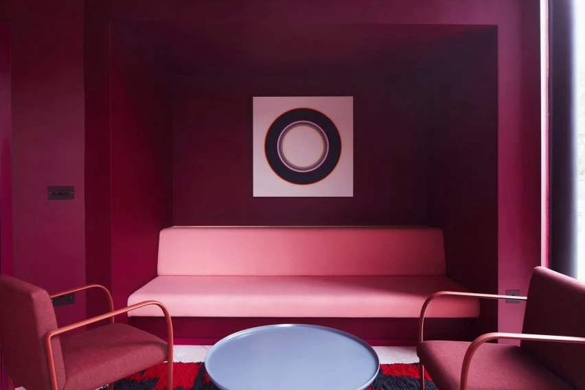
3. Create an immersive feel
Magenta is a color of harmony and balance, which evokes cheerful yet sensitive feelings. In this waiting room, the studio Ab Rogers Design choose to pair pink and purple tones to bring the psychological power of the color and create an immersive feel.
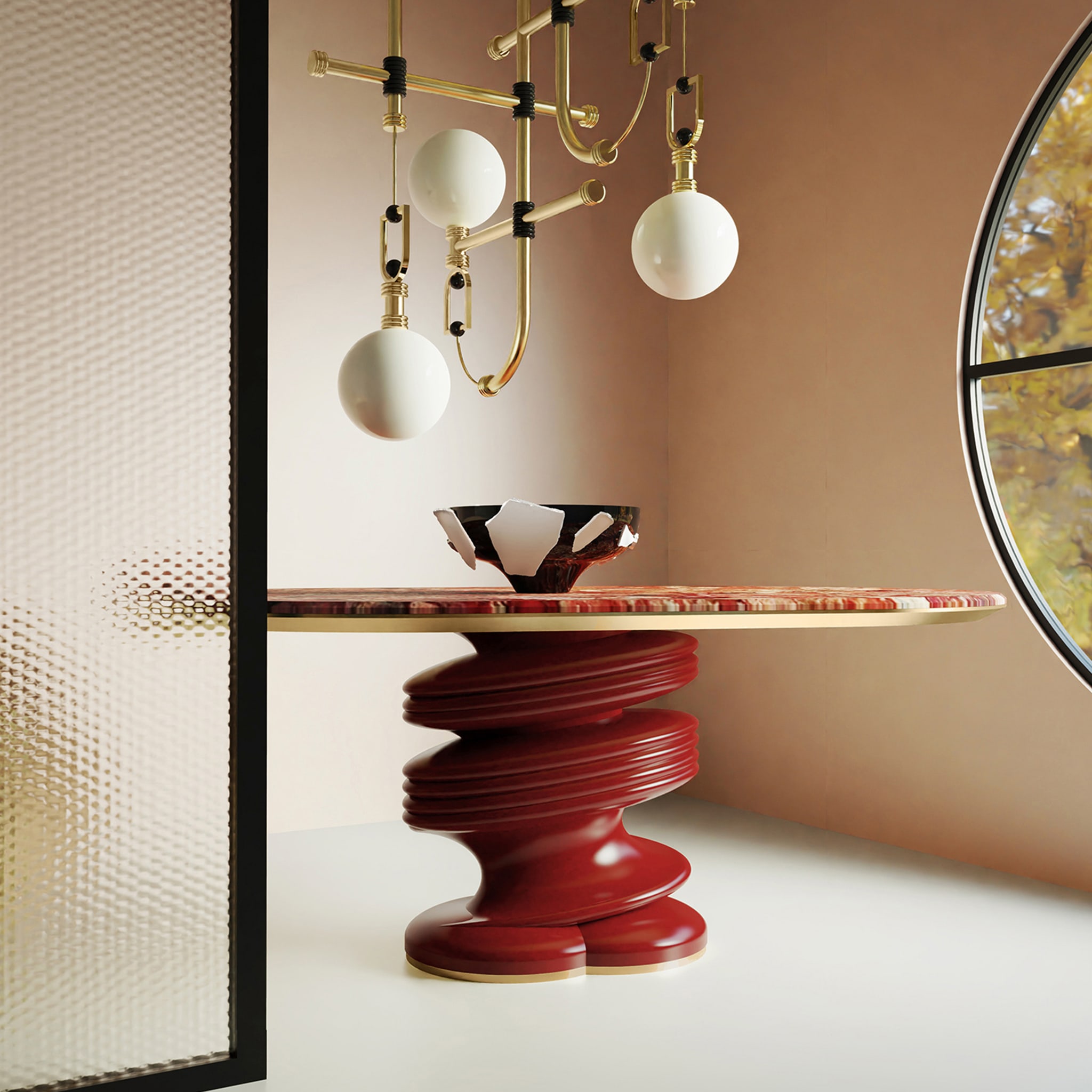
4. Highlight a piece of furniture
You don´t need to cover the room with Viva Magenta to make a statement; you can use the shade to highlight a specific piece of furniture and make it brighten up the layout. In this dining room, the Muller dining table is the star piece of the design, and the red tone makes it standout.
5. Add a pop of color
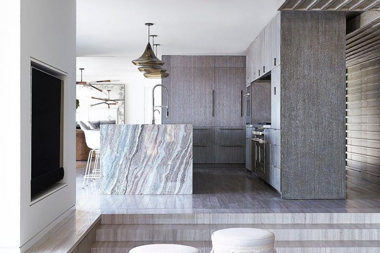
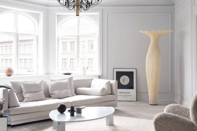
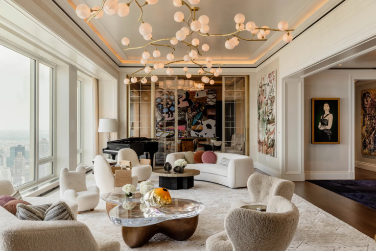
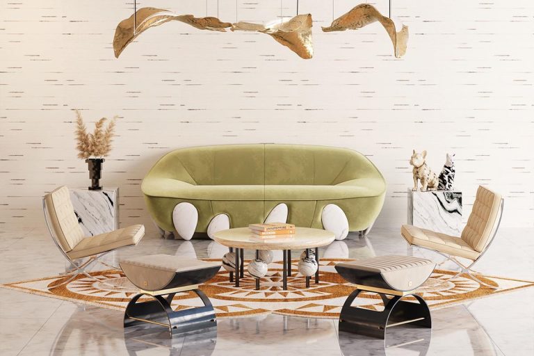
Viva Magenta is a vivid color and when paired with neutral tones, it can add the pop of color and energy that a room needs.
6. Create a focal point
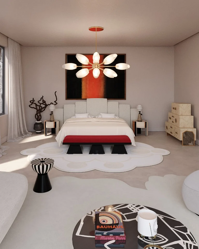
As a vibrant color, the Viva Magenta is perfect to create a focal point in a room. In this minimalist bedroom full of neutral and pastel tones, the red bench brings energy feelings and create the perfect balance to the layout.
We hope that the Pantone color of 2023 has inspired you as it inspired us for a new year full of creativity and stunning interiors. Enjoy discovering How to Use the Pantone Color of the Year in Interiors.
Source: Pantone