What is color psychology? And what is its importance in interior design? Which color fits best each interior design style? Following a series of interior design mood boards to boost both your mood and home, our team is diving deeper into the world of the psychology of interior design.
Color is a loud element in brands’ communication, for instance. In interior design, color psychology highlights an aesthetic. It also influences the mood, not only of the room but also of everyone in it.
There are some aspects that really need to be taken into account before starting to design an interior. Such as purpose. What is the purpose of your interior project? Is it a family house, or a fancy restaurant? A nightclub or a clothing boutique? Is it an outdoor living area for outdoor parties or to escape from the city?
Asking these questions beforehand will help you to choose the furniture that suits best the room – interior design must be equally functional and visually pleasing. In addition, it will help you to find the perfect materials, textures, and colors!
WHAT IS COLOR PSYCHOLOGY?
What is color psychology? And why is it important in interior design? Color Psychology is the study between color and human behavior. In other words, color psychology perceives color as a trigger of perception, feelings, and emotions in humans. Even though color’s meaning may differ from culture to culture, most of them are broadly perceived equally by humans. For instance, white is a symbol of calmness in Western Cultures. At the same time, it is a symbol of loss in Eastern cultures. Red is a color of aggression in Western cultures. Nevertheless, the very same hue brings good fortune in Chinese culture. At the same red is the color of love, both in Eastern and Western cultures.
So why is color so important in the psychology of interior design? Color psychology in the interior design highlights the purpose of the room. Additionally, it takes people to act in a certain way. We don’t find a red hospital in Western Countries, right? But what about a hospital in light blue, or white? Why there are colors that match a type of room? Color psychology is the answer.
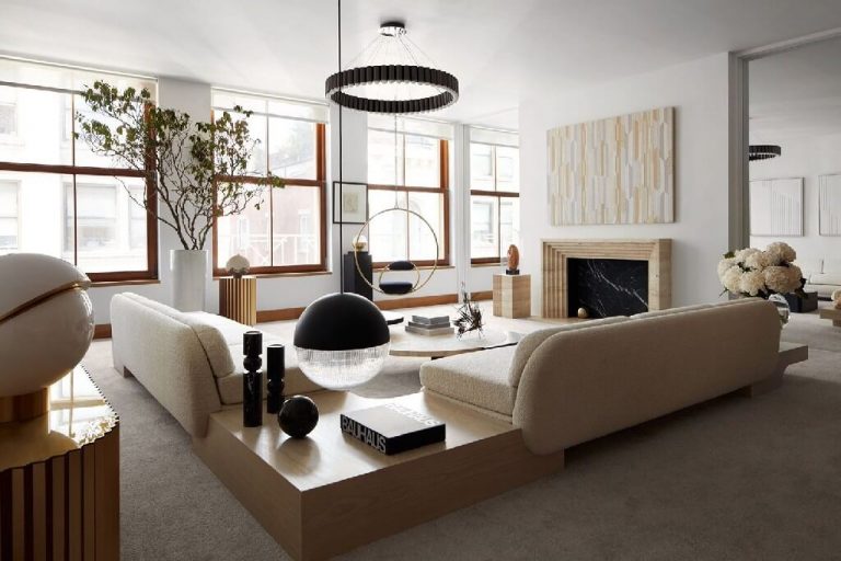
WHITE
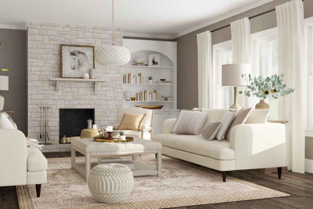
White is a primary color that stands for peace, mindfulness, purity, and wholeness. This hue also stands for freshness. As a result, white is the predominant color in minimal interior design style, beach houses, and outdoor patios. White is the favorite color for hospitals, clinics, spas, and wellness centers. The hue is also the favorite hue for wedding venues.
-
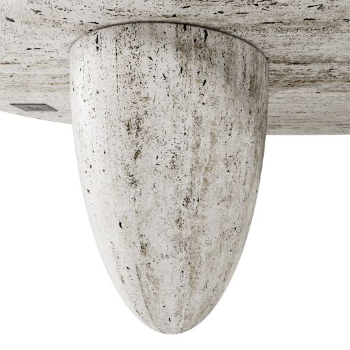
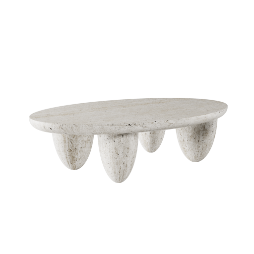
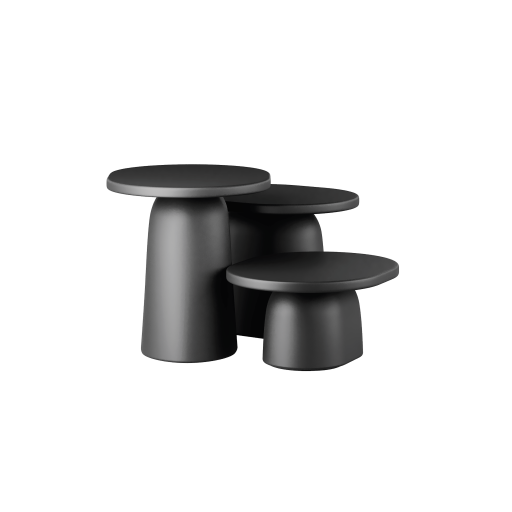
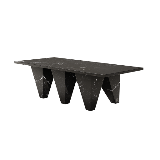
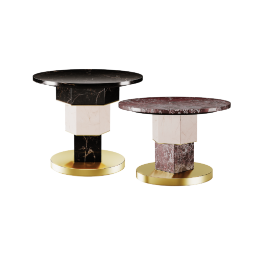
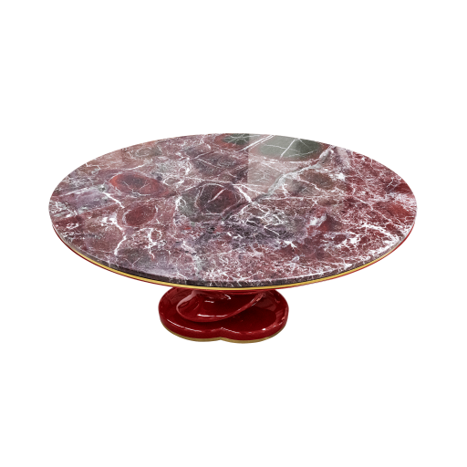
Lunarys Center Table
Center Table €6.100,00 -
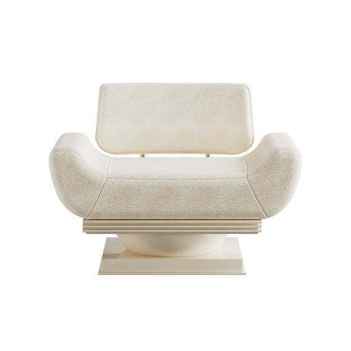
Alice Armchair Cream
Armchair €5.700,00
YELLOW
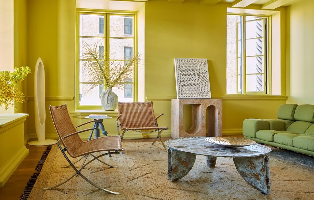
Is yellow the happiest of the colors? Maybe. Yellow is vibrant and full of energy. Yellow is the color of the sun and the core of flowers. Therefore, yellow is a color for optimistic people and joyful rooms. In interior design, the yellow color will energize people and uplift the mood of the room. This color fits perfectly a retro interior design project with Bauhaus inspiration. Yellow is also a good color for Boho or maximalist interiors.
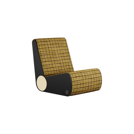
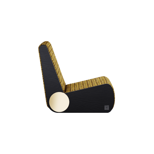
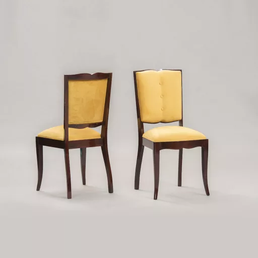
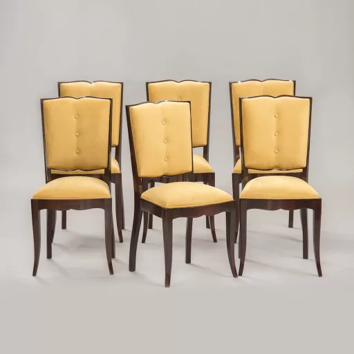
In case of looking for adding some pops of color to your interior design project, yellow is a go-to hue.
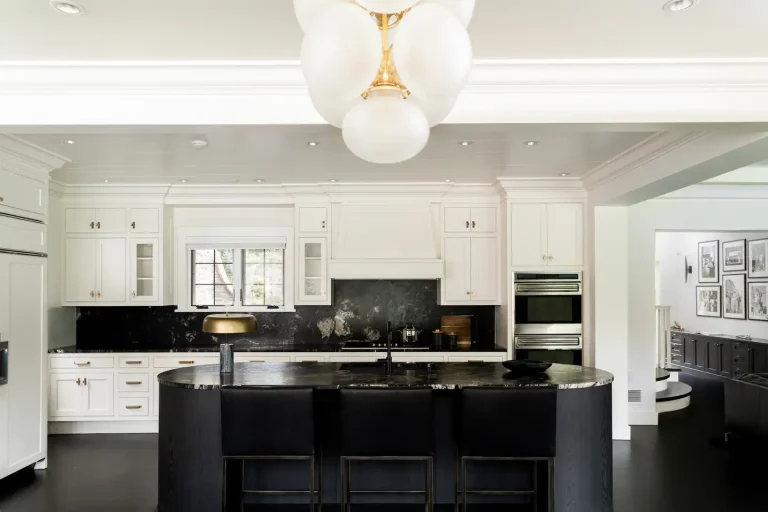
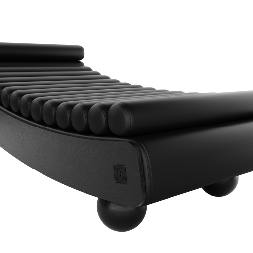
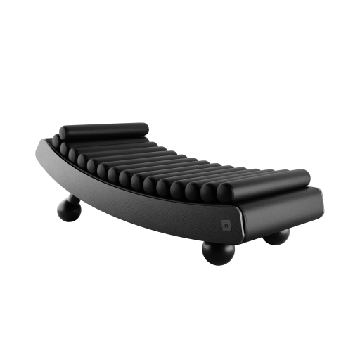
BLACK
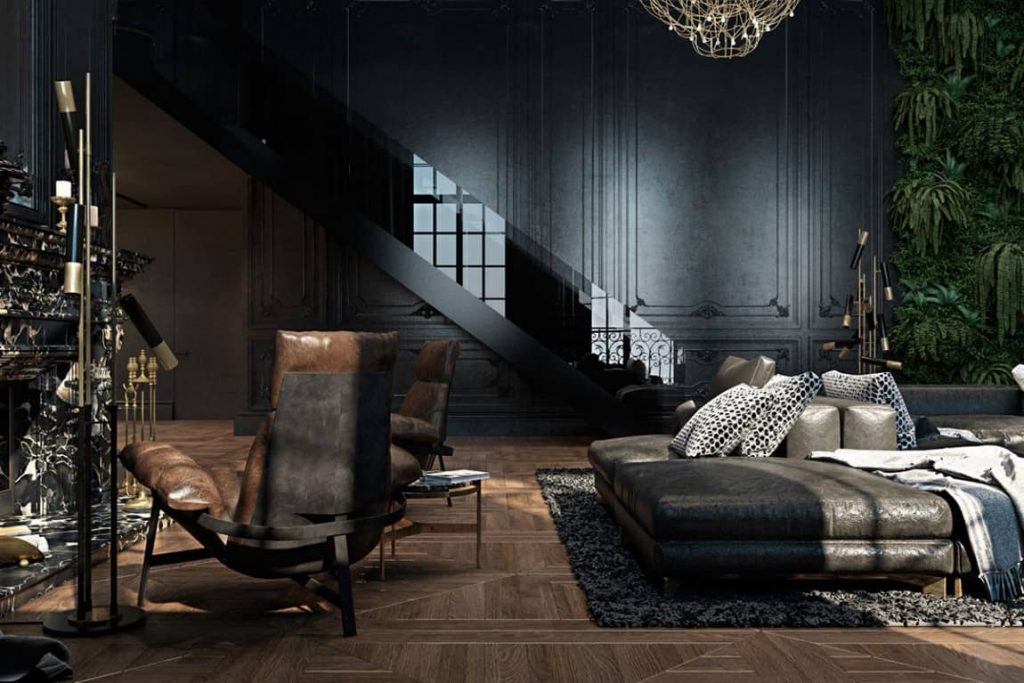
Black is simultaneously mysterious and dramatic. At the same time, black is elegant and powerful. To an interior design project, black brings an atmosphere of sophistication. Black is a good hue for a concept commercial space, such as a restaurant or store. Thus, black is a great color for an urban and contemporary interior design project.
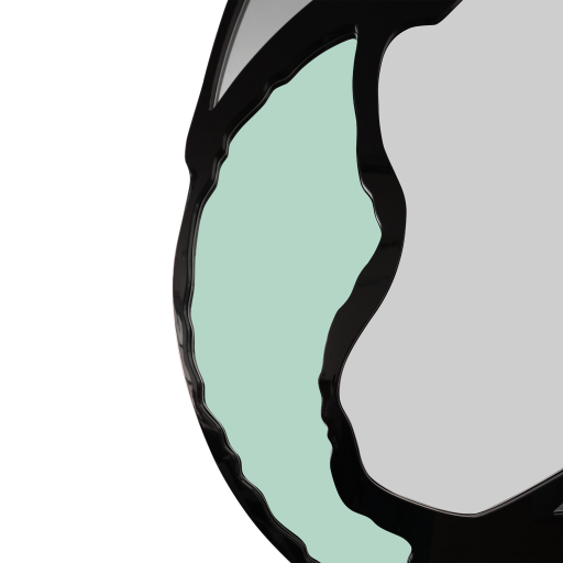
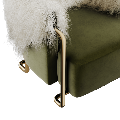
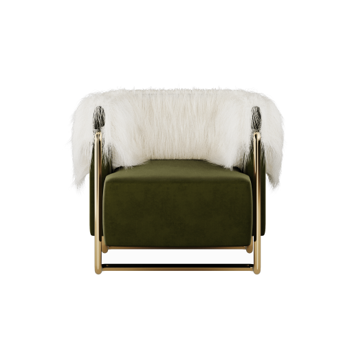
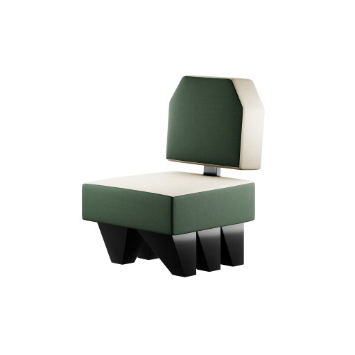
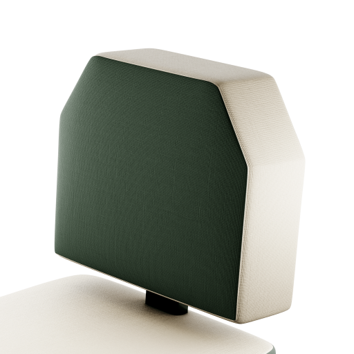
GREEN
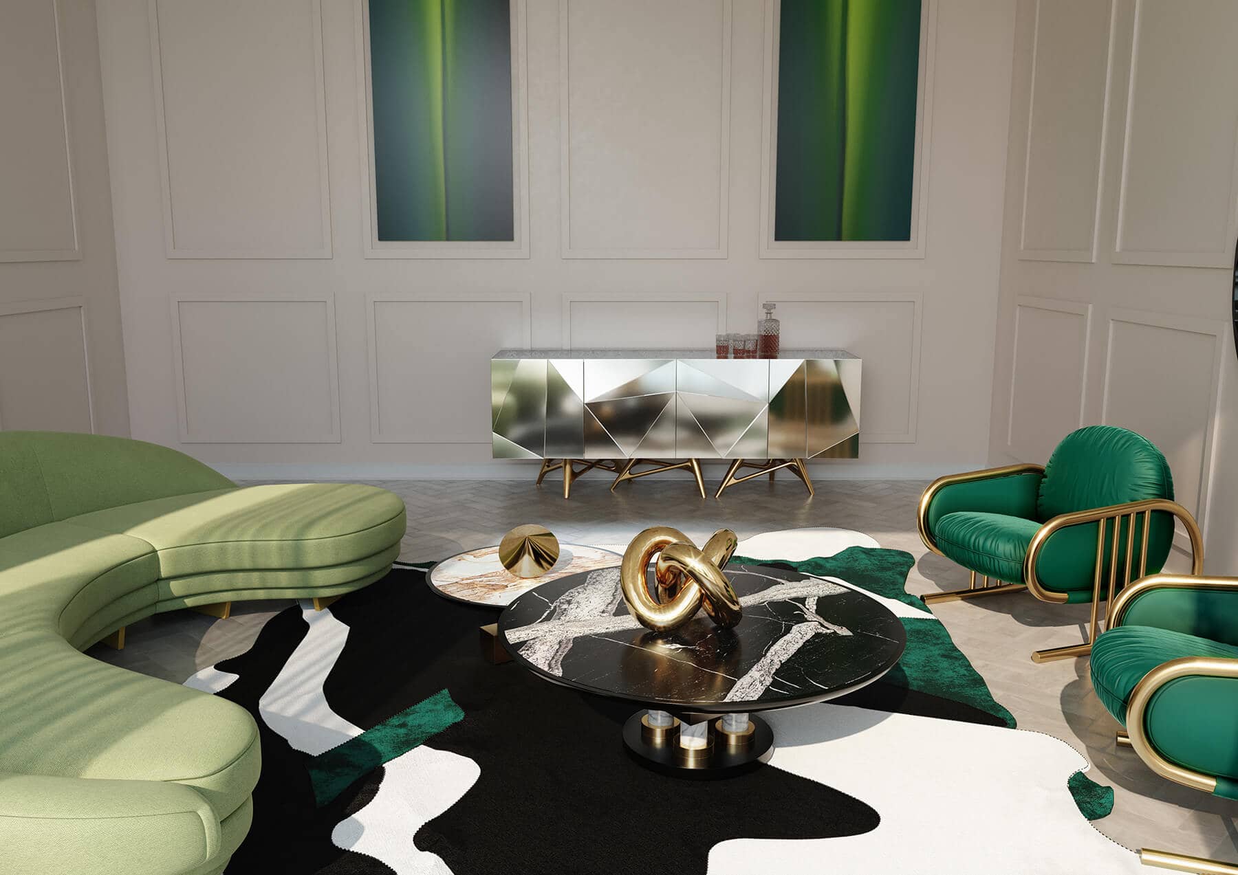
Green is the color of nature and the color of greed. We find it on leaves and on cash, green is the color of things we cannot survive without. As a result, green means fertility, growth, and prospect. Think about The Great Gatsby and the iconic ’20s. Art-Deco interior design style always demands a deep shade of green.

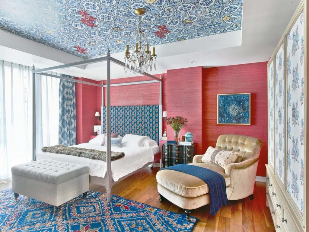
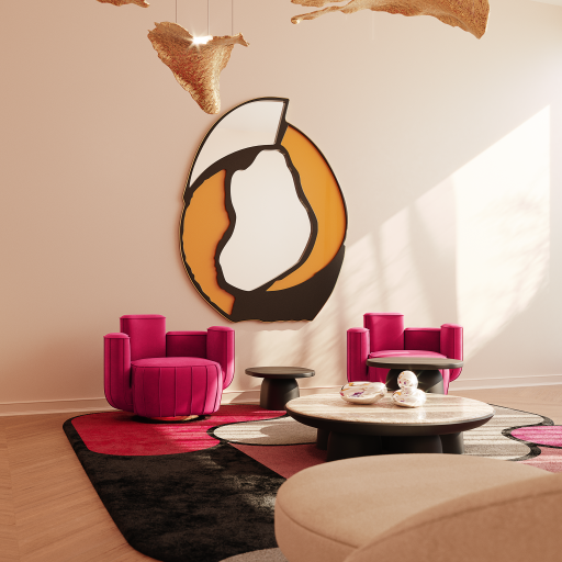
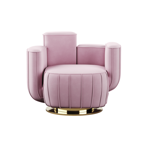
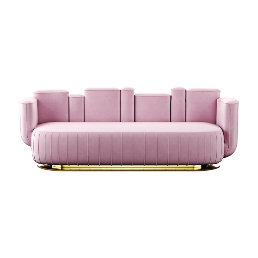
PINK
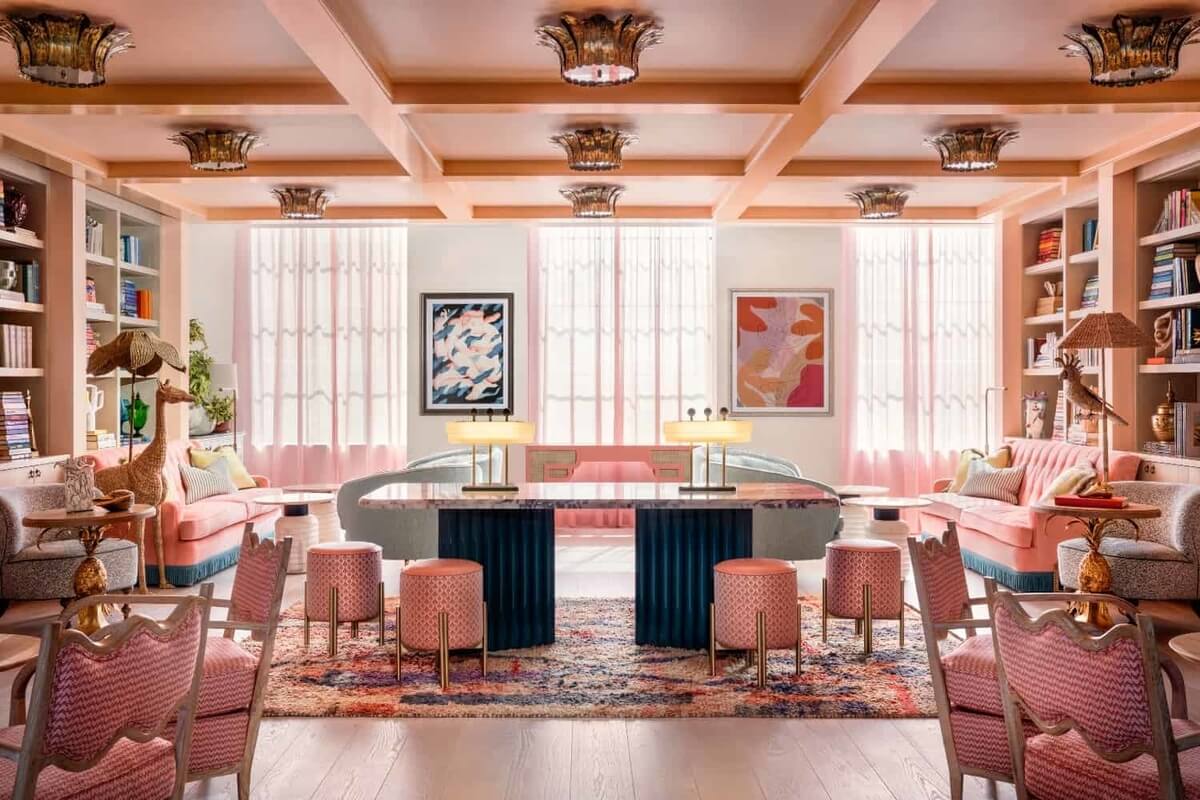
Another underrated color in interior design is pink. Pink is often associated with little girls’ rooms. However, pink is a powerful hue in color psychology. Pink is romantic, caring, and emanates feelings of nurturing and kindness. The soft hue is very involving. In this manner, pink is a great color for commercial interior design projects.
Discover more this kind and classy hue in interior design on our article focused dedicated to the psychology of pink.
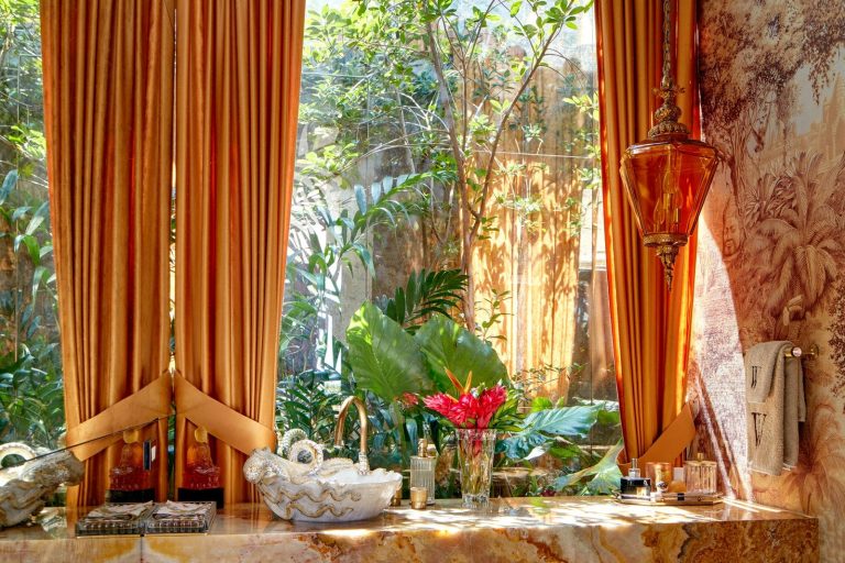
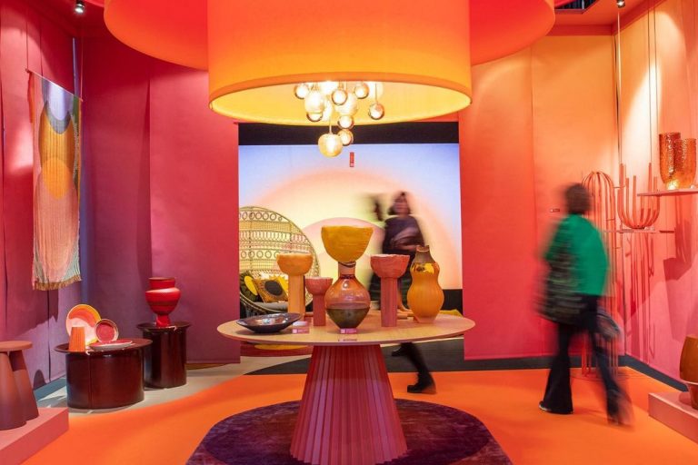
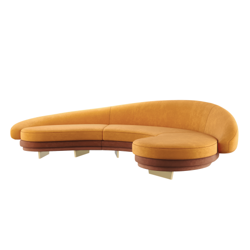
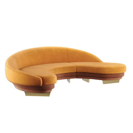
ORANGE
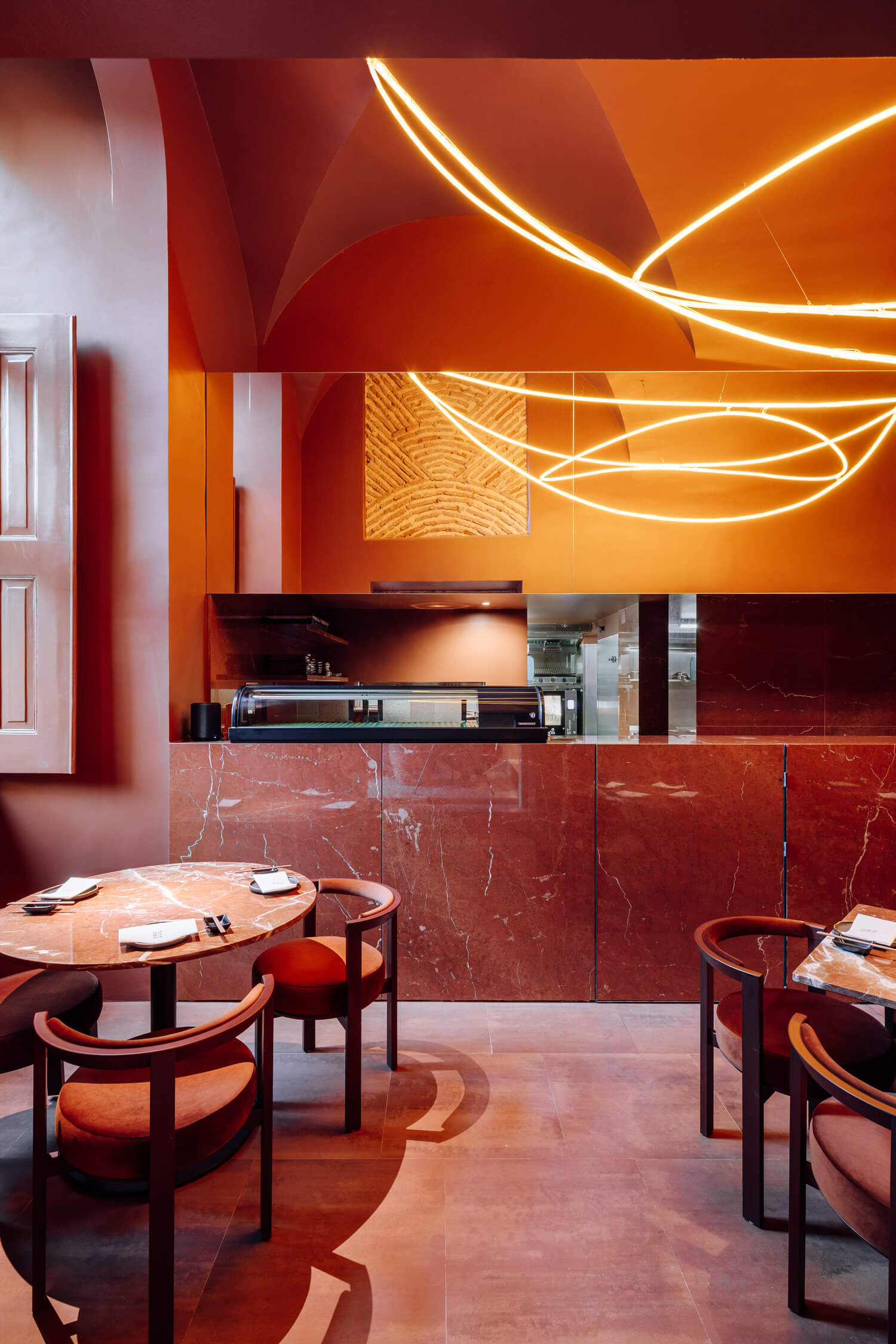
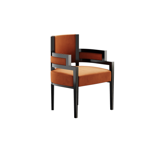
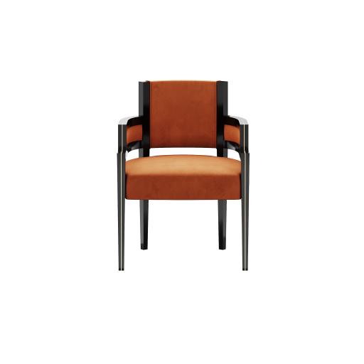
Orange is happy and joyful. The juxtaposition of red and yellow results in a warm and fierce color. When it comes to color psychology in interior design, orange is the best color for restaurants. Why? Because orange triggers hunger and sociability. The perfect duo for a great dine-out night.
See how Lisbon-based Spacegram design studio mastered a monochromatic orange restaurant in Lisbon.
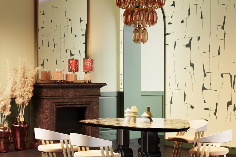
RED
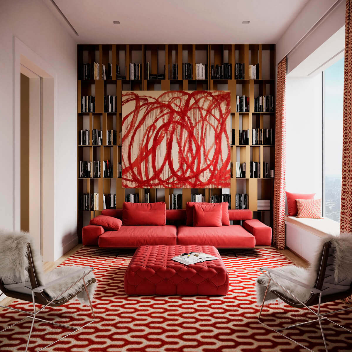
We all know that red is the color of passion. But maybe not all of us are aware of its role in color psychology in interior design. In a residential project, red suits best a home office or a home gym. The color red triggers ambition and energy. Red also triggers excitement, that’s why the passionate hue is often associated with aggression. In an interior design project, red is daring and provocative. Depending on its shade, red can fit in any interior design style.
-
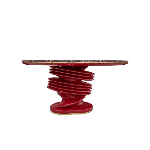
Muller Dining Table
Dining Table Get Price -
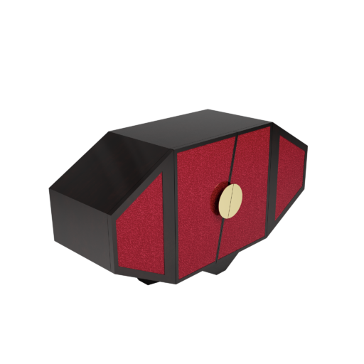
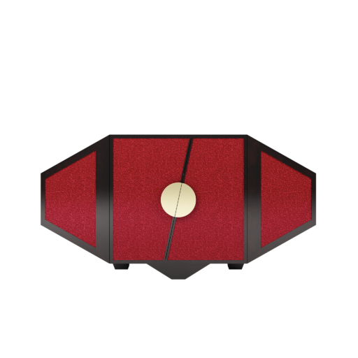
Roy Sideboard
Storage Get Price
Are you interested in learning more about color psychology and the psychology of interior design? Discover our mood board series with colors and textures to upgrade your interior, your mood, and your life – Summer Interior Design Ideas To Boost Your Mood & Interior Design Boards To Boost Your Mood.
Source: https://www.luxdeco.com/blogs/styleguide/colour-psychology-interior-design