Yellow paint is easygoing, but it can be tricky to pull off. In part, Yellow is in the spotlight because Pantone’s Color of the Year is Illuminating, and in part, because the design world is shifting from its excellent gray-white phase. Colors like yellow and even red are making their way back into mainstream trends.
Los Angeles interior designer, Kelly Wearstler’s new paint collaboration with Farrow & Ball, which includes the perky Citrona, a lemon tree tribute to California, seals it. Buttery walls can look classic when the room is styled to highlight the jovial shade. However, a charming canary yellow can turn childish when painted on as an afterthought.
Consider the Light (And Window Views)
Natural light affects the color that you choose. Farrow & Ball’s soft Citrona is earthy, allowing its underlying tones to embrace intense light, making space with a vast skylight or large expanses of windows ideal. For dim spaces, look to buttery pastel yellows that give off luminosity even on dreary days are a perfect choice.
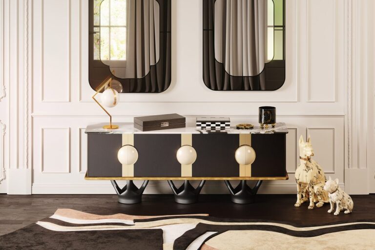
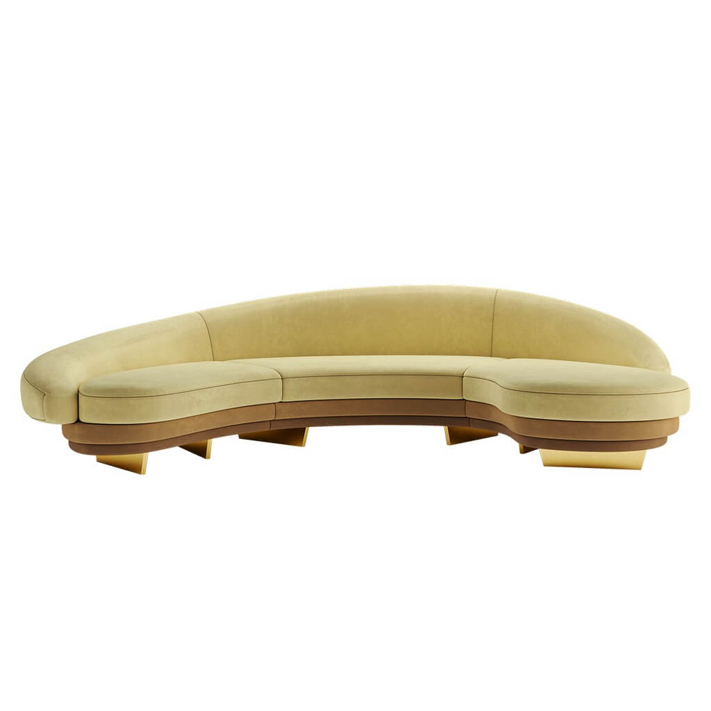
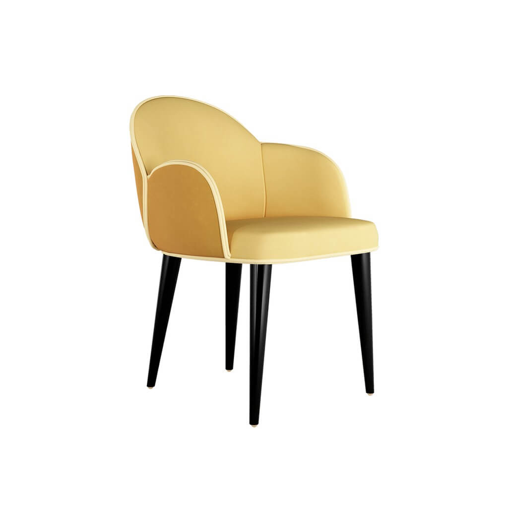
HOMMÉS Sugestion
Giulia Sofa is a mid-century style sofa. This luxury sofa promises to be the absolute protagonist of a living room project. Its mid-century modern inspirations are reflected in its shapes, revealing an eclectic and luxurious lifestyle.
Make Classic Modern
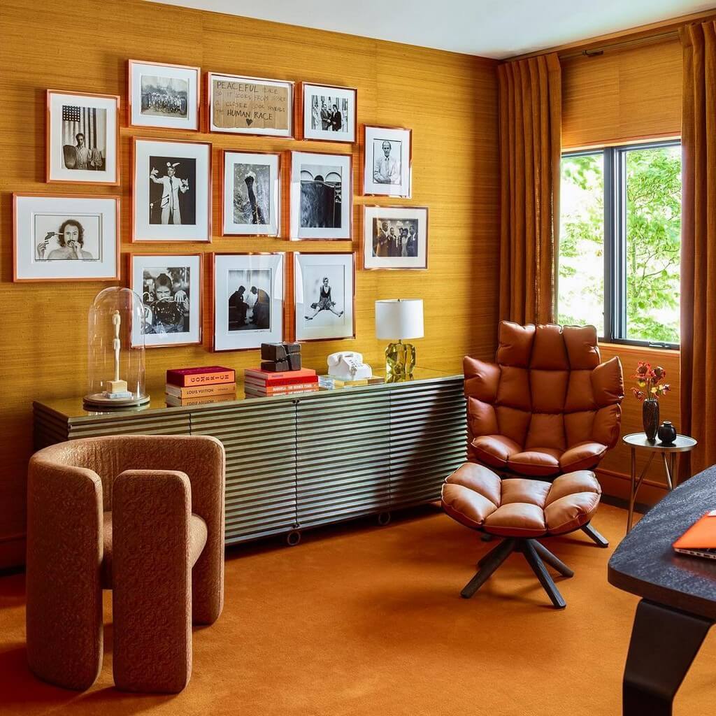
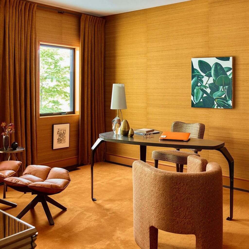
The citrine office of Bridgerton’s Simon Basset is as handsome as the duke himself. Take note, and add traditional tones to honor your home office. Its glow adds enough brightness to fuel productivity but does not run circles around your desk. When deciding on which spectrum of yellow to go with, consider this advice by Scottsdale designer Anissa Mendil: A warm yellow has orange undertones, and a cool yellow has green undertones. Choosing between a warm or a cool yellow will affect the other finishes in the room, such as wood and metals.
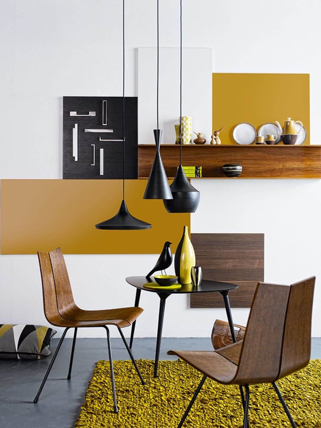
Layer Yellow on Yellow on Yellow
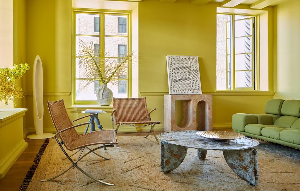
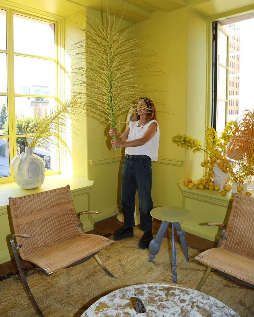
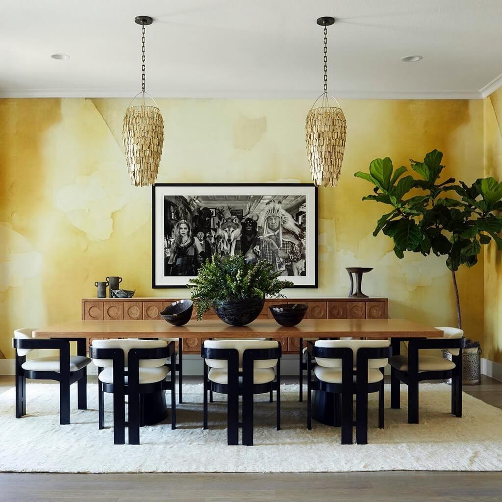
One of the reasons oceans are so mesmerizing is because the various blues dance with one another. Apply this principle by integrating different yellow paint tones, from soft pastel to deep mustard, to add dimension. The mesmerizing watercolor-like mural creates a warm aura of modern calm. Alternatively, take an all-encompassing approach by flooding the space with this bright pigment. Whether you dive deep into yellow or layer the hues, décor rich in blues, greens, and pinks will further make the yellow pop.
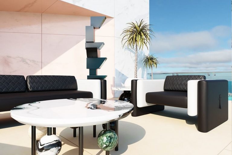
HOMMÉS Suggestion
Scille Dining Chair is a luxury armchair that features an asymmetric seat, composed of curvilinear panels that intersect each other. An original and comfortable chair, ideal for a contemporary dining room project.
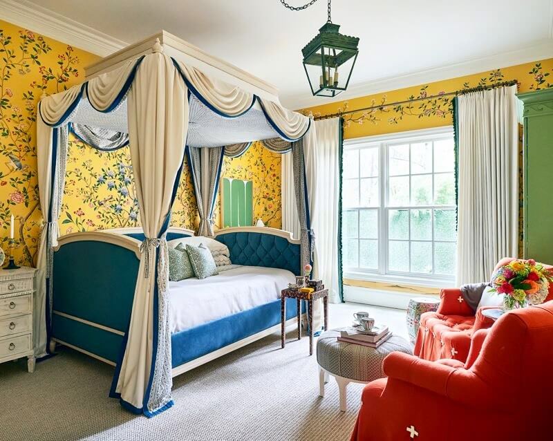
Retreat Into Chinoiserie
Perhaps we should thank Kehinde Wiley for lusting after decadent floral wallpaper, especially if it looks like this de Gournay x Erdem confection adorning a guest bedroom created by San Francisco designer Dina Bandman. Although a completely new design, its chinoiserie theme reminds memories of something older, antiqued; but, the bright yellow background makes it fresh.
Tone It Down With Wall Decor
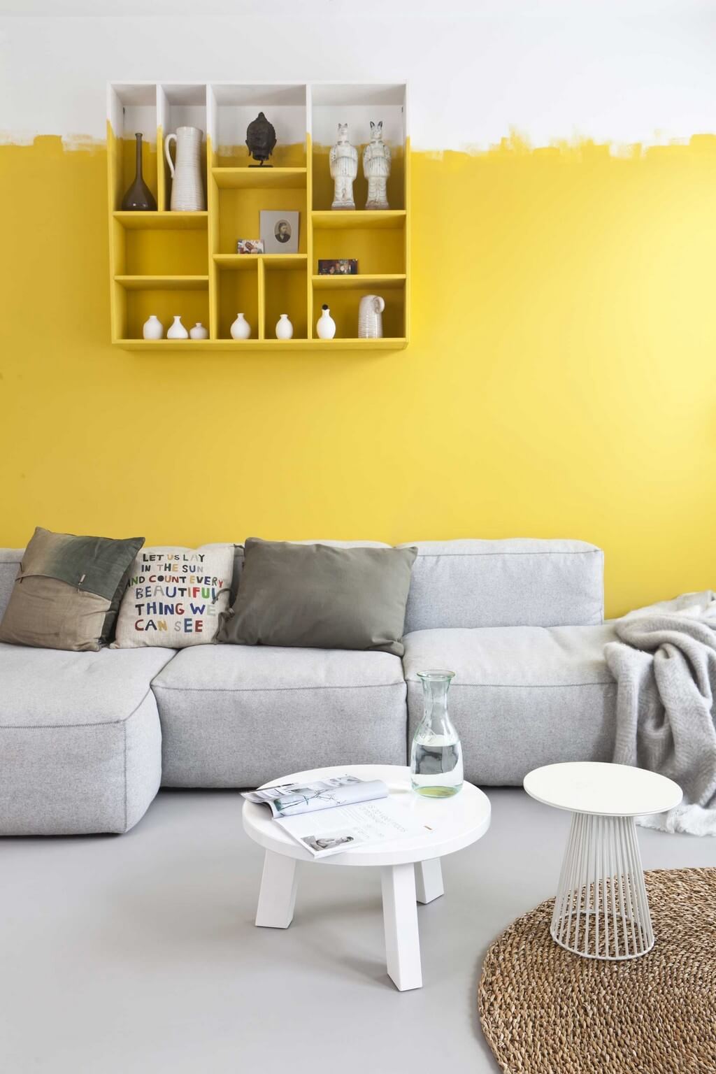
Careful about trying yellow? Camouflage it. Yellow is a powerful color, so being mindful of its impact is vital when using it in design. Taking a yellow accent wall, for instance, and create contrast by layering artwork over it. This helps balance the intensity of the color and provides added interest.
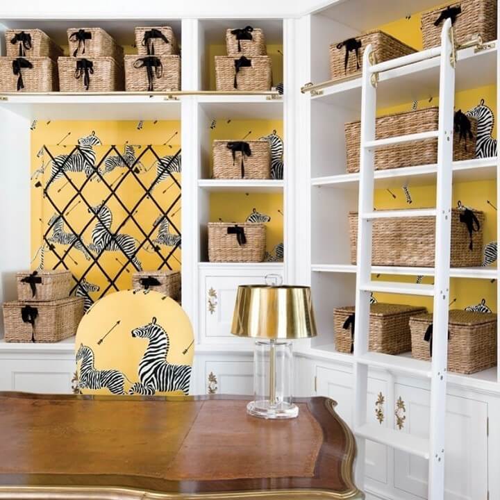
Use It As an Accent
A yellow accent makes sense if you do not want to commit to a full-on yellow room. For a humorous take on the yellow wallpaper, rein in Scalamandre Zebras to liven up any space for adults and kids. The vibrant, truly happy lemon shade works beautifully with white or navy.
We really hope you liked our article. Feel free to pin all the images to your favorite Pinterest board. Meanwhile, you can also visit our Pinterest boards to get more inspiration.
Get more ideas for your projects and find functional, stylish, and sizable lighting and furniture choices: