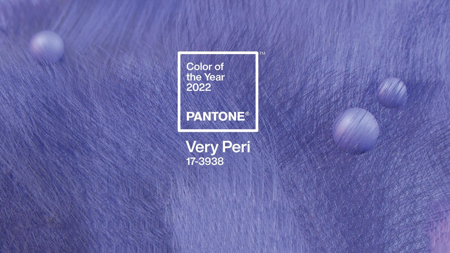
Very Peri is the 2022 Pantone Color Of The Year… And we can help but wonder how to use Very Peri in interior design projects?
This captivating newborn hue celebrates the virtues of the digital world and, eventually, the blend of physical reality with virtual reality. Therefore, Very Peri in interior design projects guarantees an immediate sensation of futurism.
We dug into the internet and found amazing interior design projects whose color of choice is a subtle interpretation of Very Peri. And learned some things that you’ll like to acknowledge, especially if you’re planning to use the 2022 Pantone Color on your next interior design projects.
Very Peri is simultaneously feminine, powerful, futuristic, and joyful. This blend of blue and red is a great color for commercial interior design projects (as you can see in the examples below). In residential interior design, Very Peri bombs on tapestry, upholstery, and home accessories. And if you could only match Very Peri with one interior design style that would be the Memphis Design Style. Read the article and discover why.
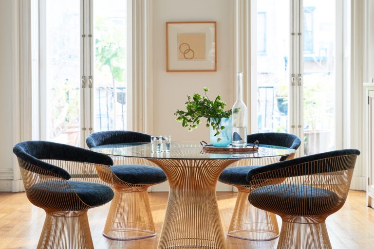
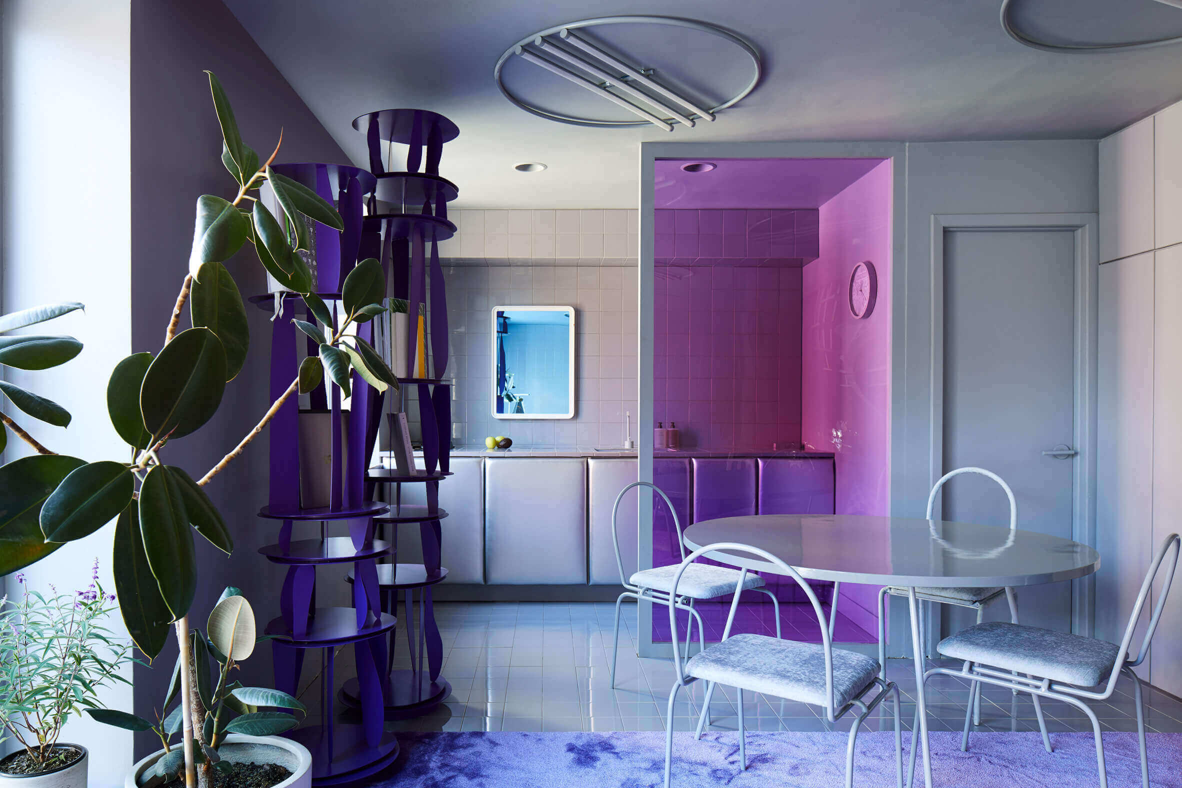
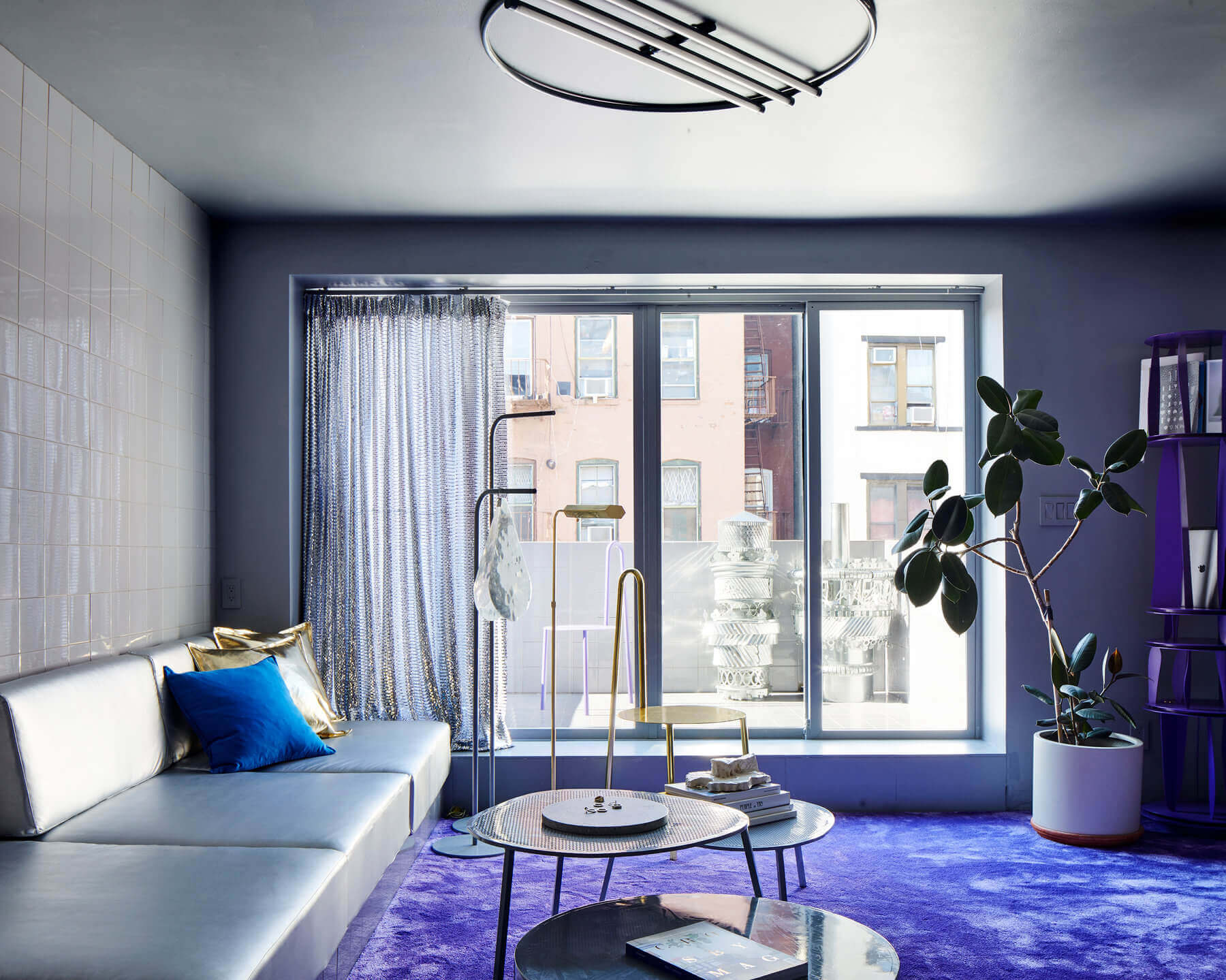
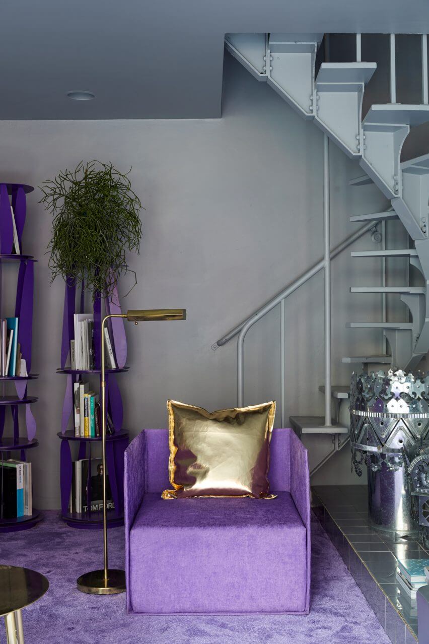
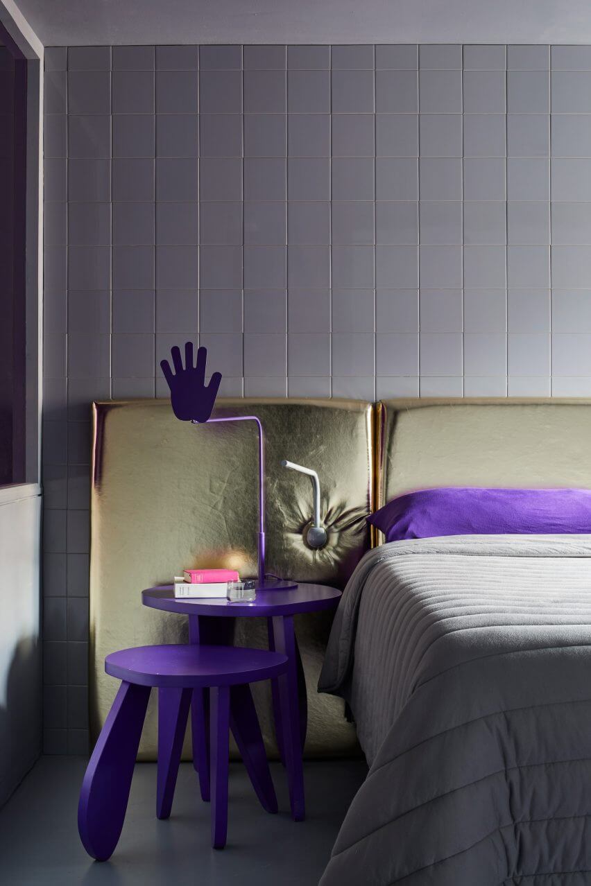
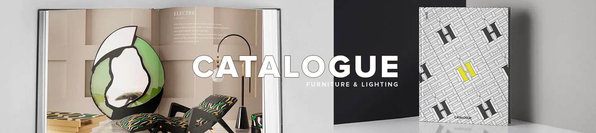
HARRY NURIEV’S APARTMENT, CROSBY STUDIOS
The apartment of Crosby Studio‘s founder and CEO, Harry Nuriev and Tyler Billinger, match their essence as both a couple and creatives.
Harry Nuriev and Tyler Billinger set down roots in the historic neighborhood of NoLita in New York. The couple’s apartment is a mesmerizing exemplar of how to use the 2022 Pantone Color Of The Year Very Peri in interior design.
Crosby Studio injects its modern and bold narrative into this futuristic pad with carpentry, upholstery, furniture, and home accessories in Very Peri.
The color palette of Harry Nuriev’s apartment is completed with white, pastel blue, and captivating golden and silver fixtures.
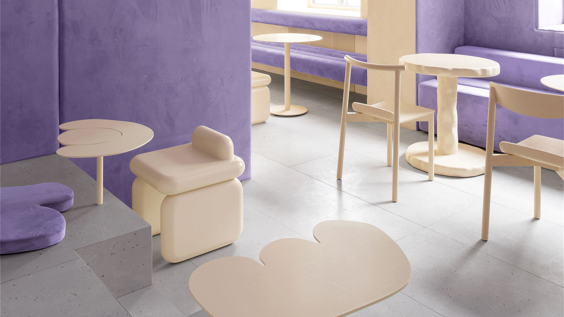
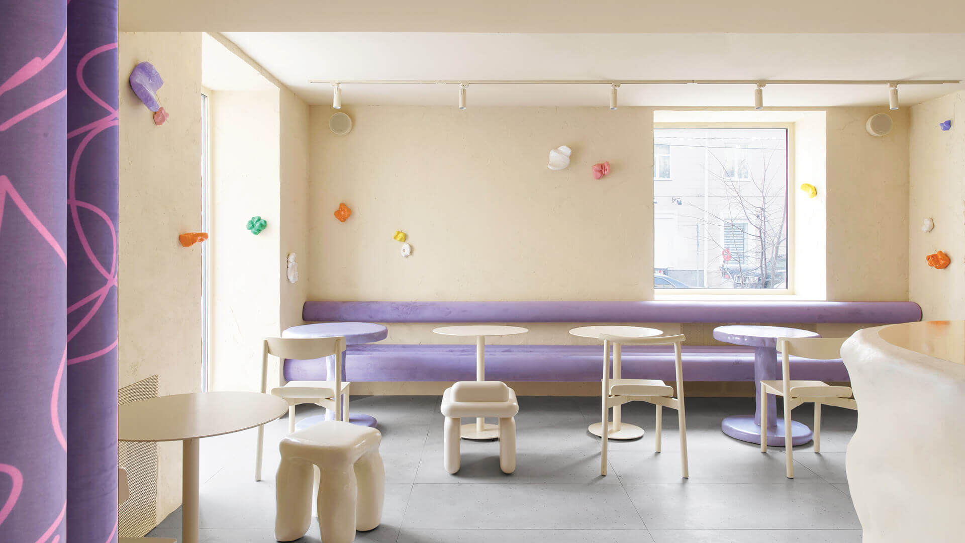
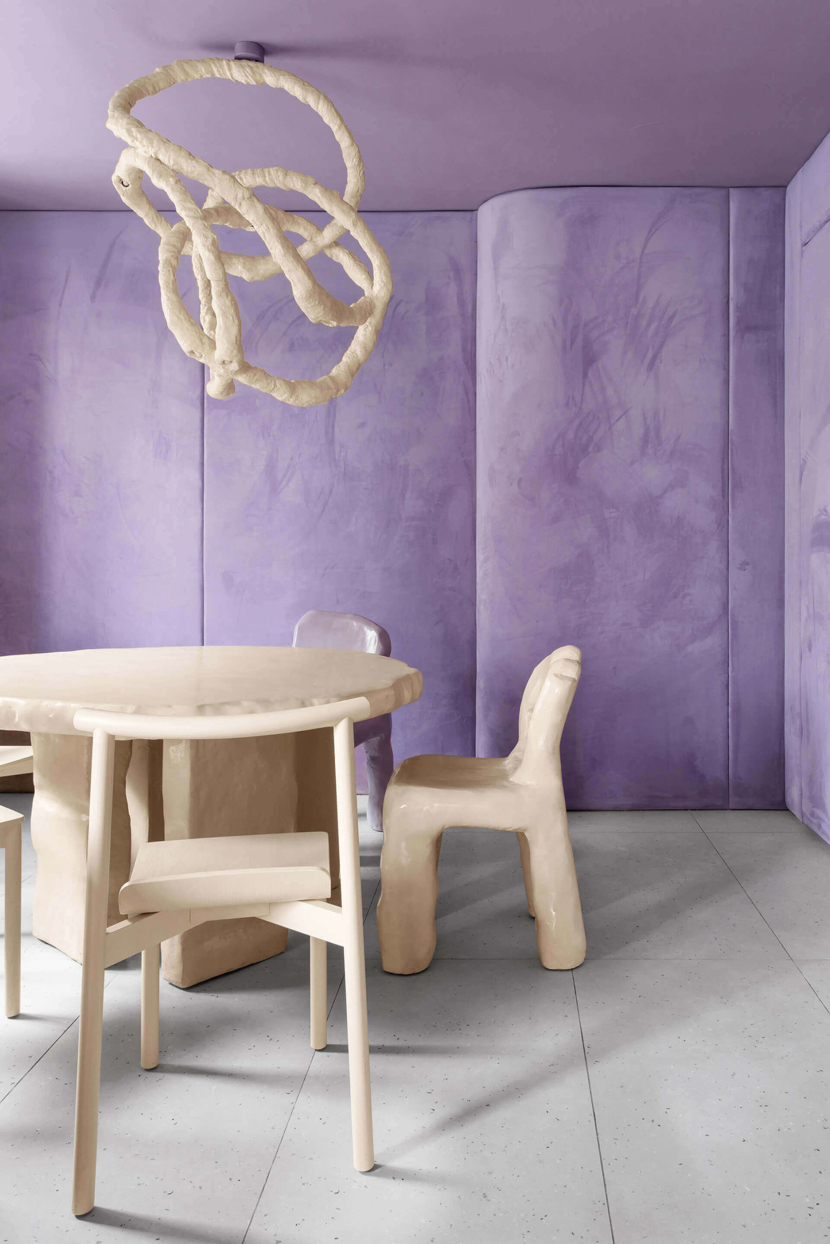
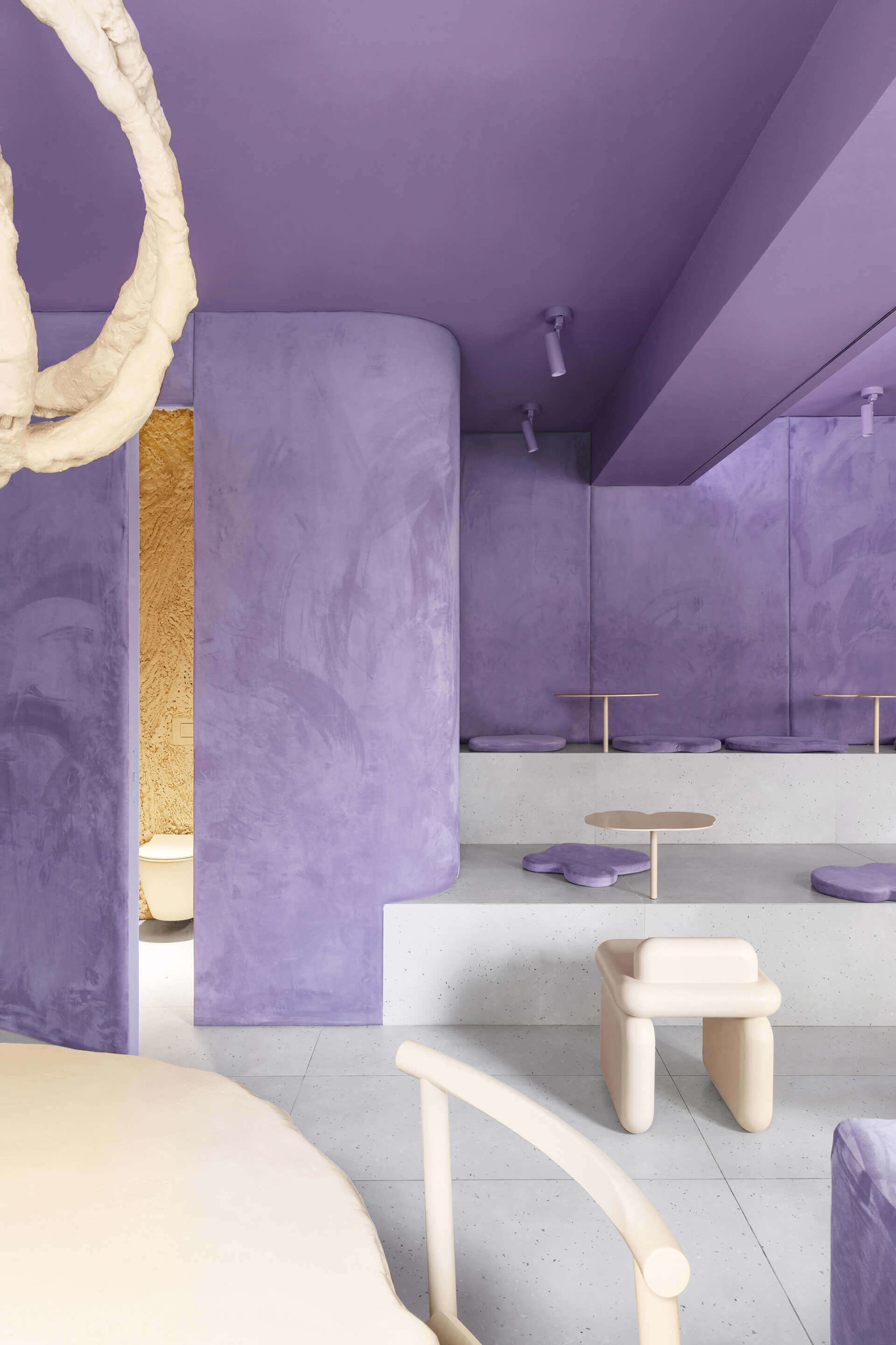
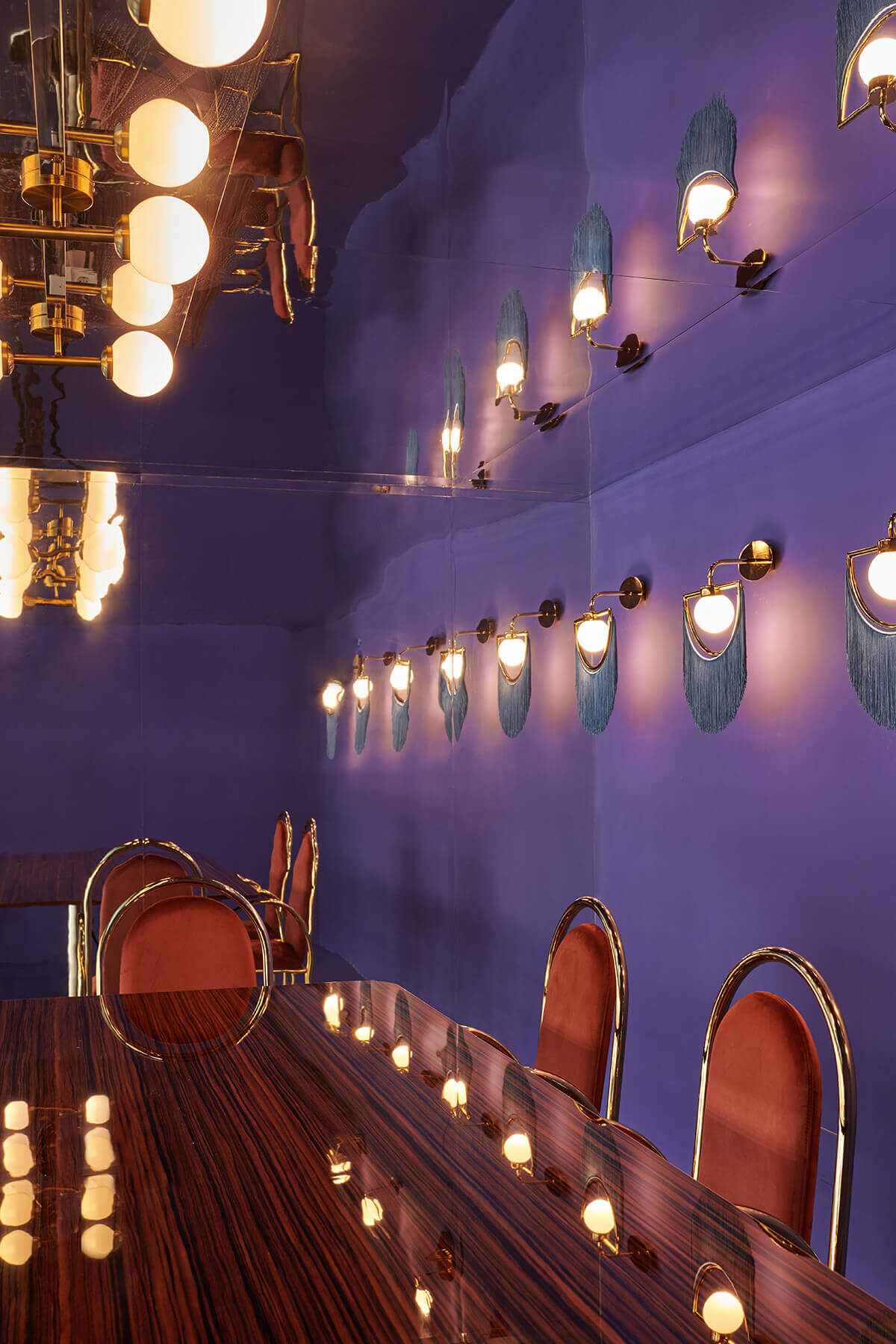
CAFE KRUJOK, EDUARD EREMCHUK AND KATY PITISKAYA
Cafe Krujok, named after a round doughnut, in Russia is a delicious-looking commercial interior. Eduard Eremchuck and Katy Pitiskaya are the creative behind this velvety and squishy space. The velvet walls, stools, and benches mimic colored donut-glazing.
The purple velvet contrast with the sleek texture of Cafe Krujok’s sandy white furniture.
Very Peri in interior design has the power to create an unworldly reality.
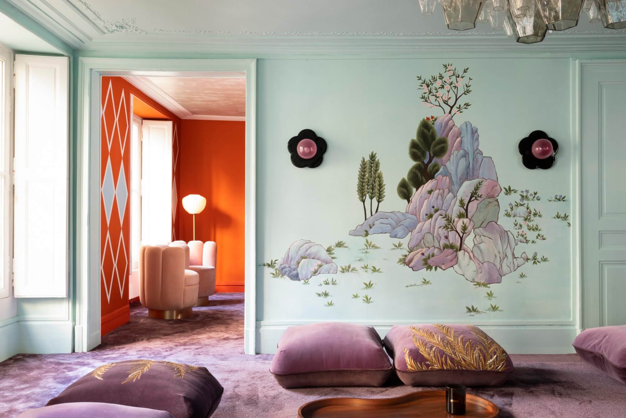
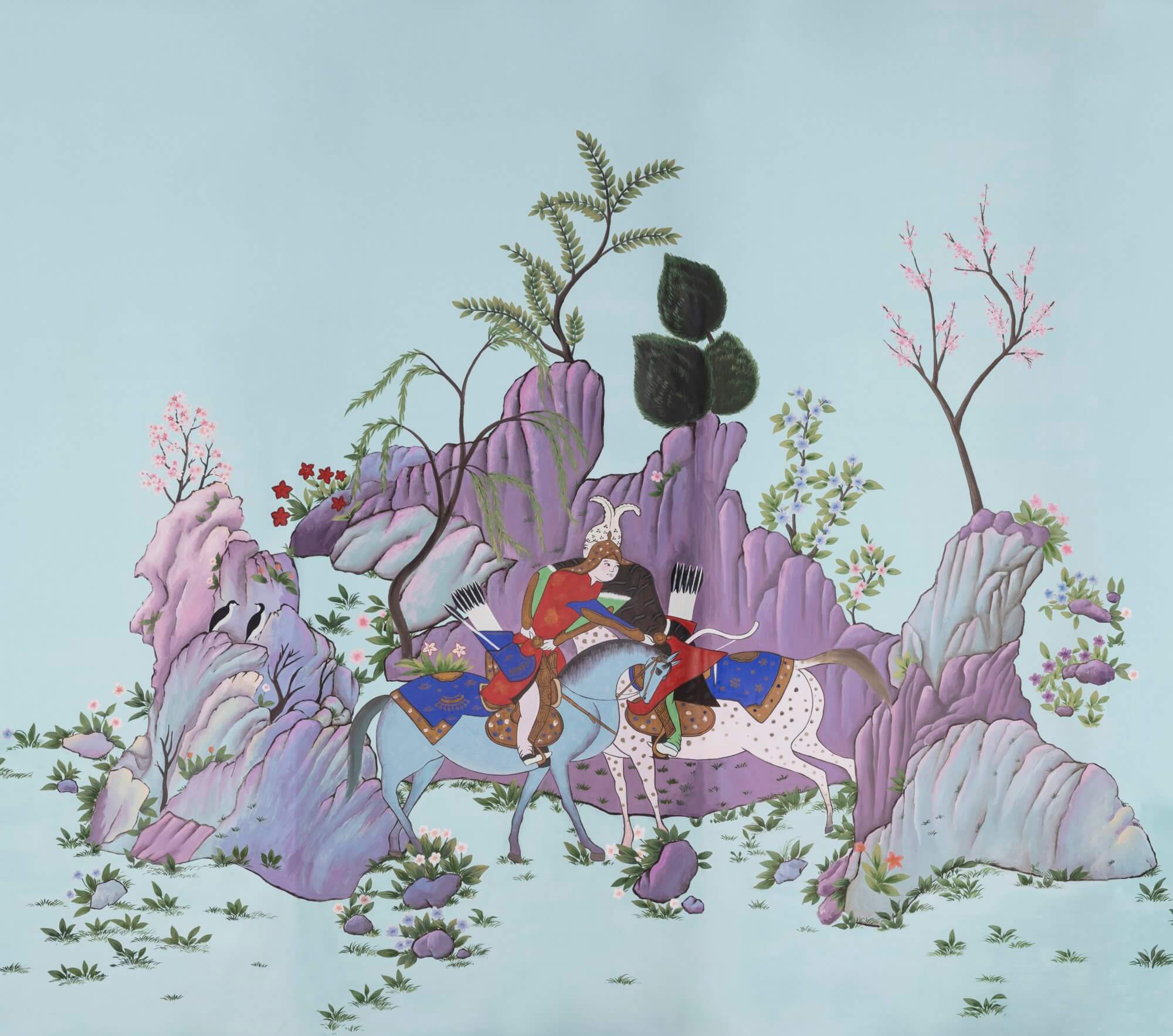
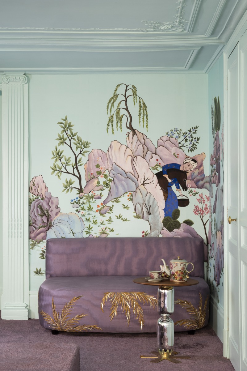
DE GOURNAY SHOWROOM, INDIA MADHAVI
If someone gets color, that person is India Madhavi. Her collaboration with the De Gournay invaded the haute couture wallpaper brand’s showroom in Paris with a surprising color palette – to the lilac and purple with reddish highlights, India Madhavi added a vivid orange.
“Abbassi In The Sky“, the name of the wallpaper design, juxtaposes the urban landscape with oriental lines.
This collaboration between India Madhavi and De Gournay is the reason to use Very Peri in interior design.
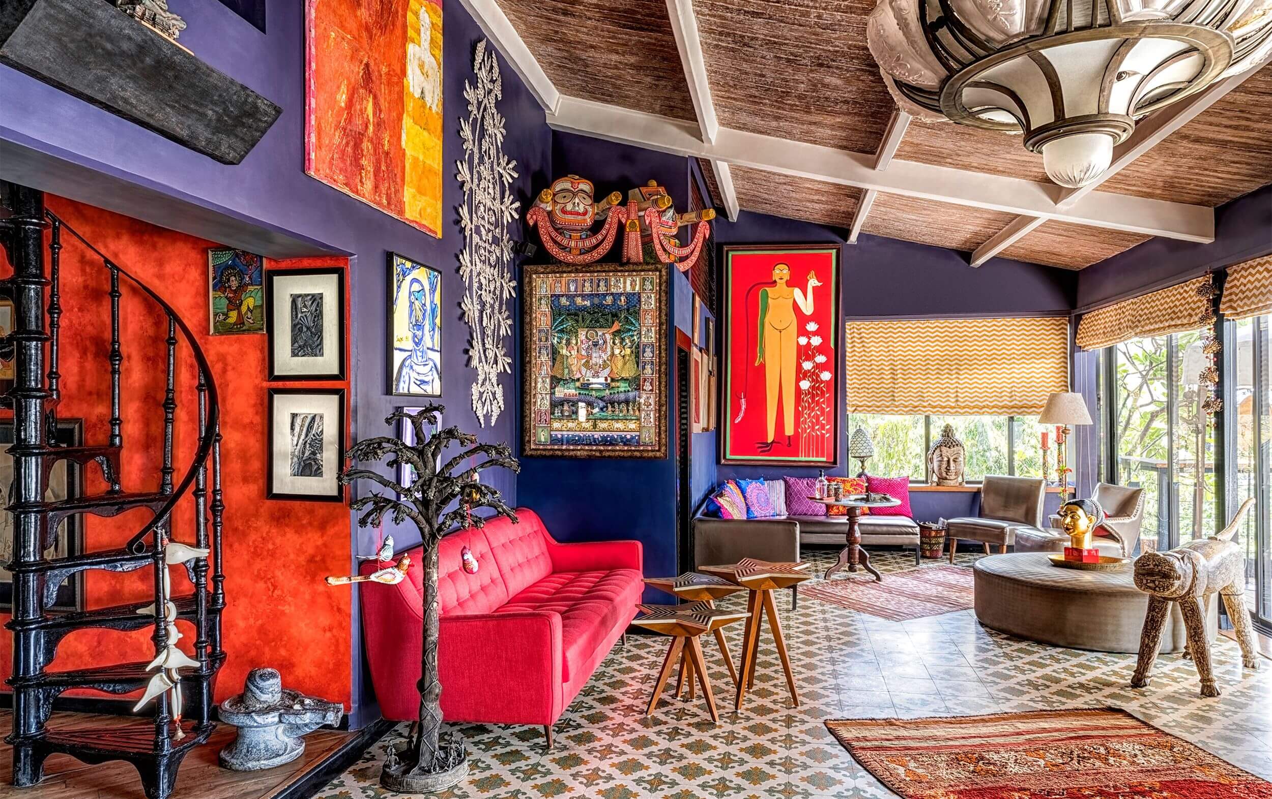
HOME IN HISTORIC MUMBAI, SRILA CHATTERJEE AND MAHESH MATHAI
Even though the Pantone Color Institute presented us with a color that aims to take us to an unexplored world, Very Peri in interior design can be used to revive a feeling or memory from the past, usually associated with happiness and comfort. At least, that’s what Srila Chatterjee did to the apartment in Mumbai that belongs to Chatterjee and the to the best half, Mahesh Mathai.
The couple bought and restored the home of their dreams – a 1904 Indian colonial-style building in a historic area of Mumbai. The walls of the living room have a purple hue that nods to Vey Peri. the Pantone Color of 2022.
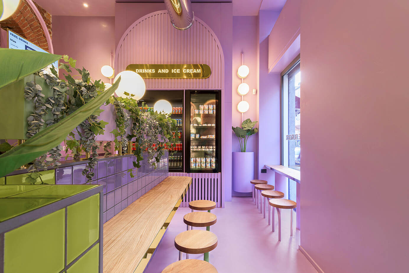
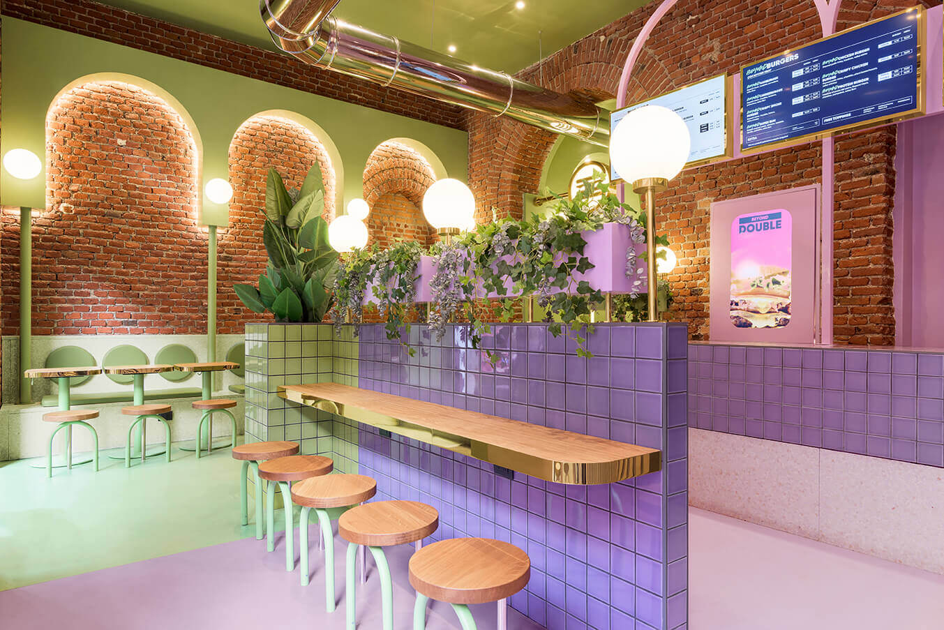
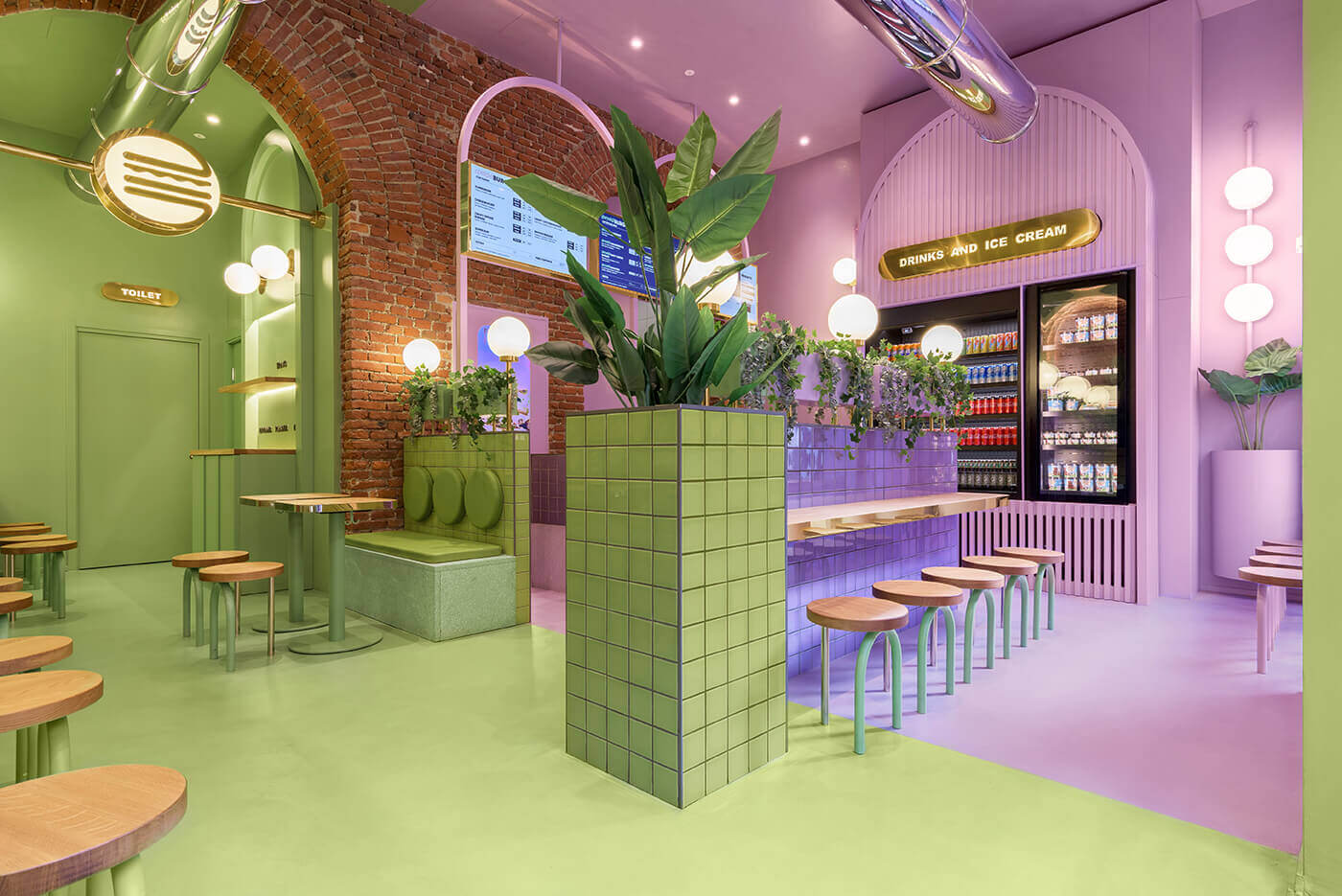
BUN BURGERS BLIGNY, MASQUESPACIO
Masquespacio has been named the “Wave Of Future” or “Young Talent Of The Year”. Located in Valencia, Spain, Masquespacio is an award creative studio created in 2010 by Ana Milena Hernández Palacios and Christophe Penasse.
Combining the 2 disciplines of their founders, interior design and marketing, the Spanish design agency creates custom-made branding and interior projects through a unique approach that results in fresh and innovative concepts.
The use of Very Peri in interior design came prior to Pantone’s invention to the creative studio. Several of Masquespacio’s commercial interior design projects have a lilac-blue hue that floats around the Very Peri pigmentation, such as a burger eatery in Milan, an eyewear boutique in Bogotá, a coworking space, or a Japenese food-chain in Valencia.
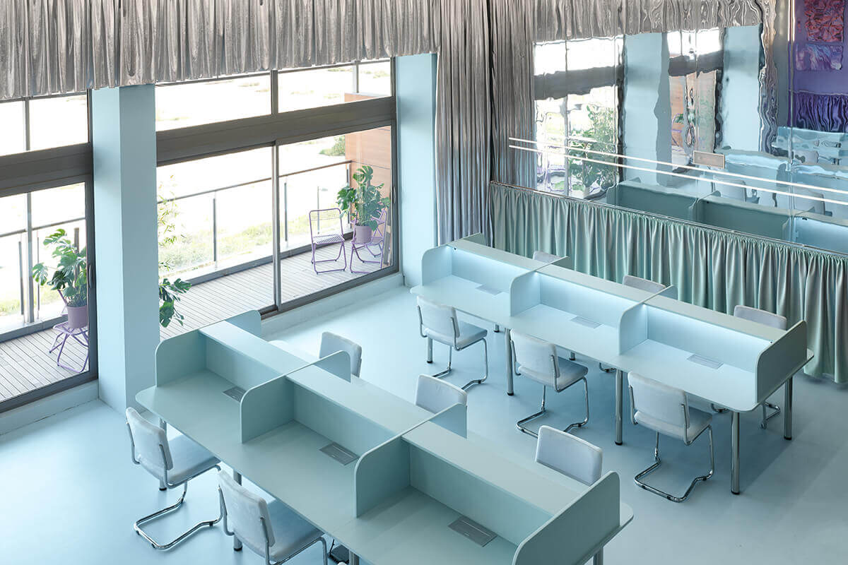
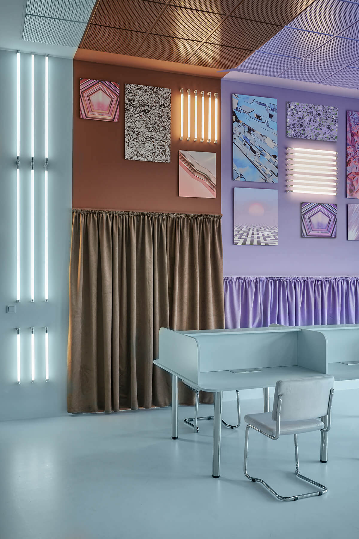
CABINETTE CO-WORKING, MASQUESPACIO
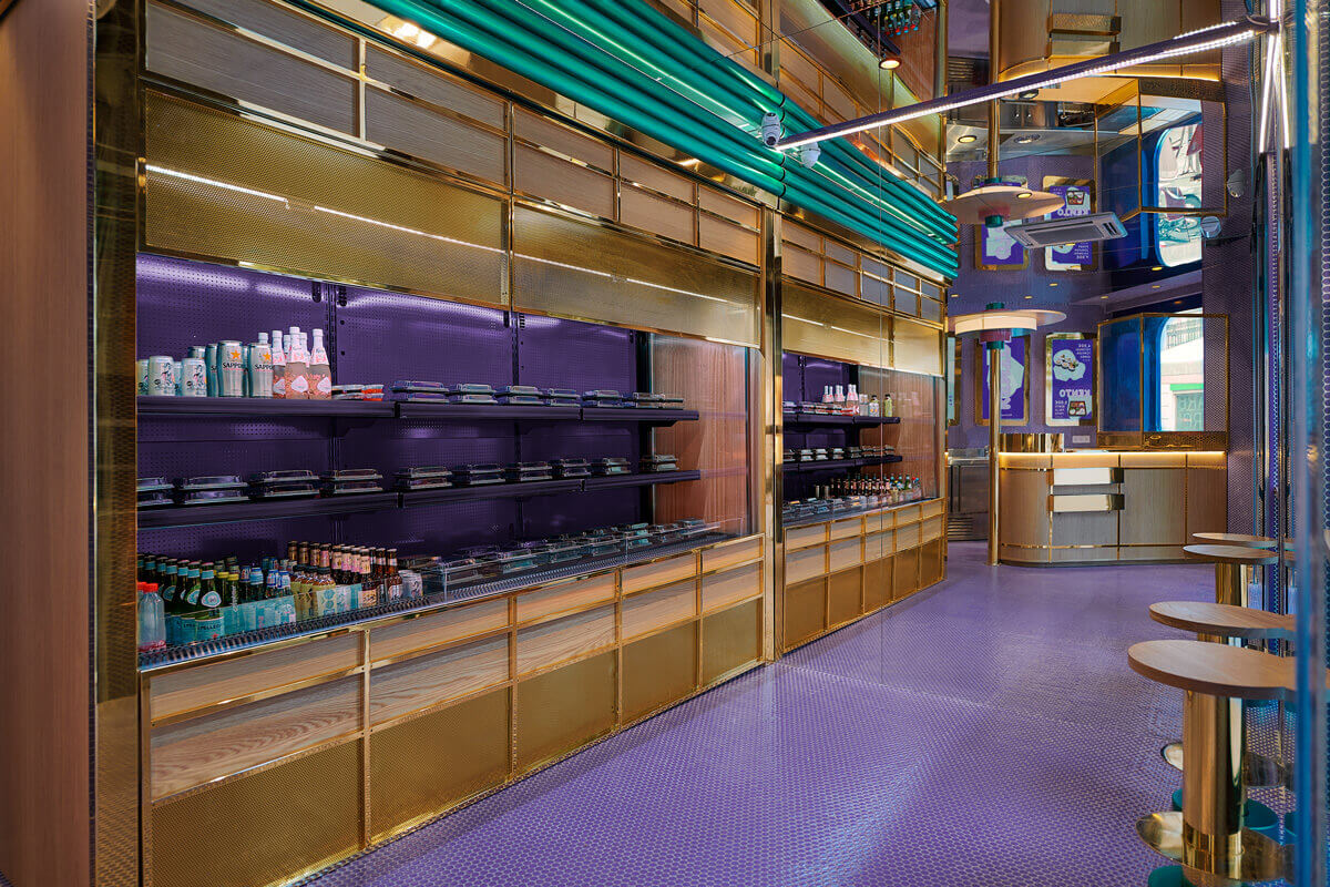
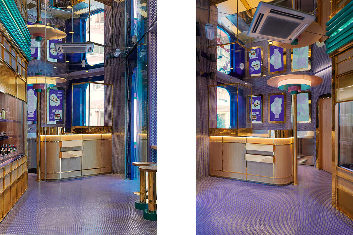
KENTO TAKE AWAY STORE, MASQUESPACIO
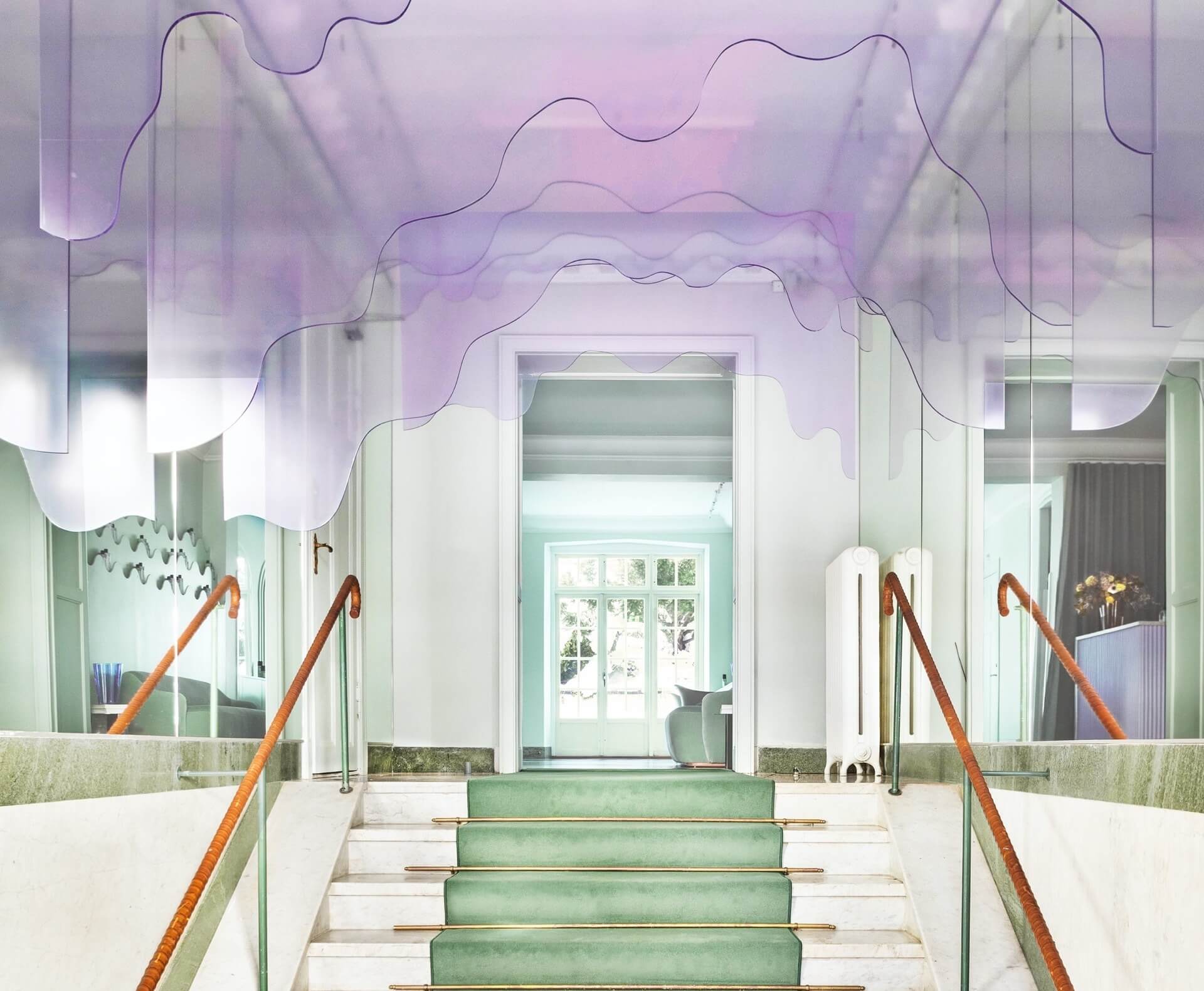
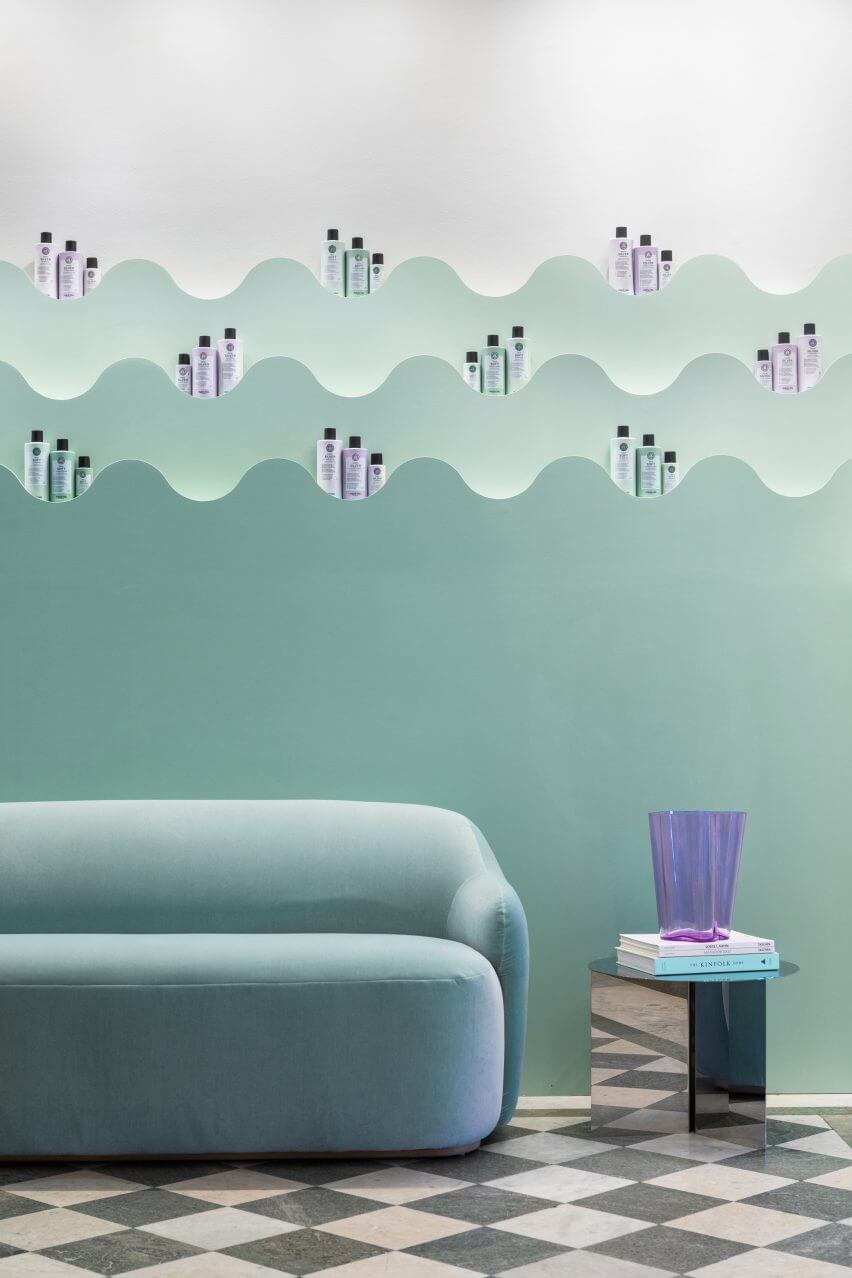
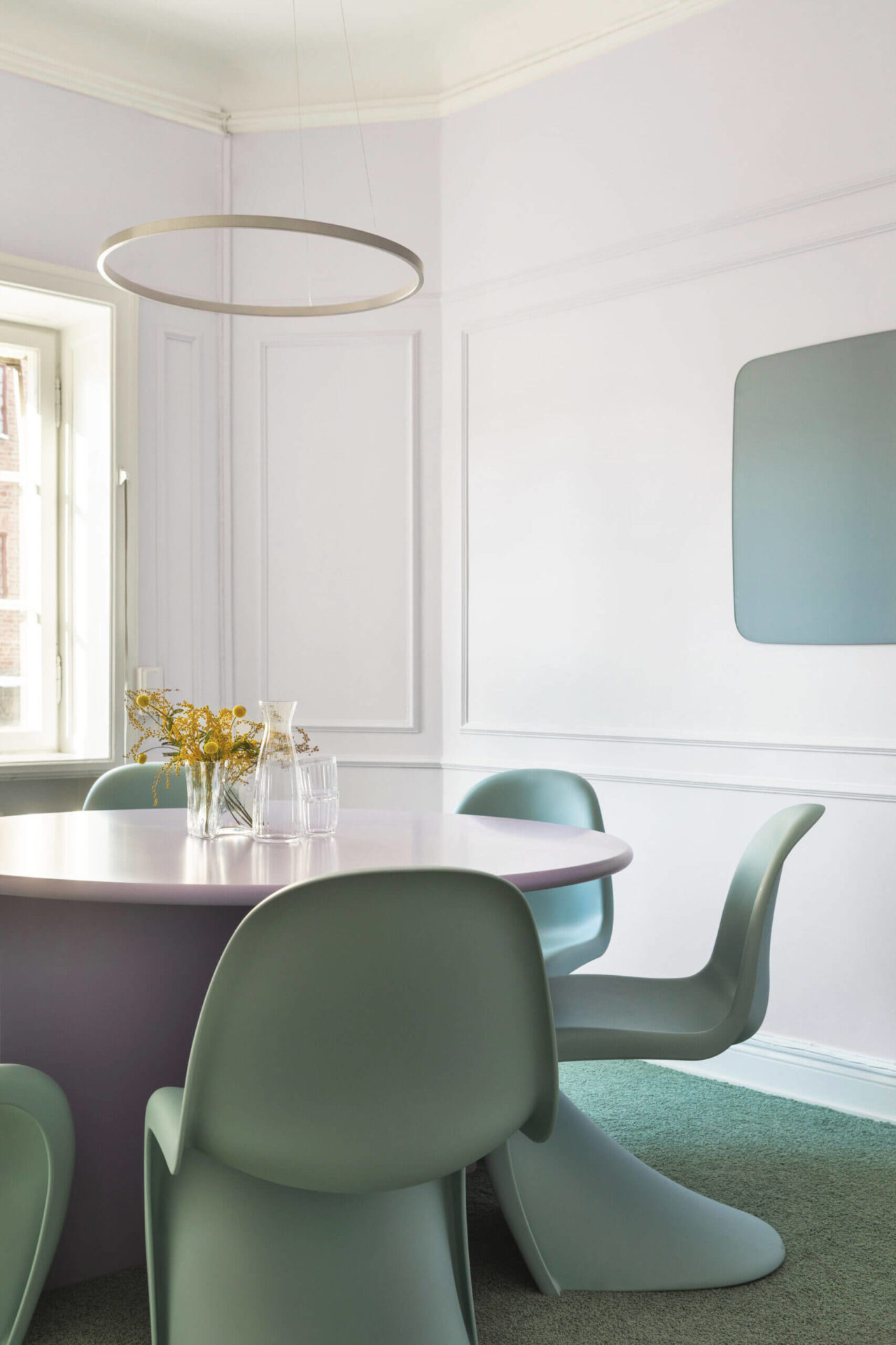
MARIA NILA HEADQUARTERS, ASKA
Strong and flavored define the renovation of Maria Nila’s office and hair salon in Stockholm. The Swedish architecture studio ASKA used a palette of pastels, namely pink, peach, blue, and lilac.
The four-storey building was redesigned to create an immersive experience. The headquarters of Maria Nila is the world of Maria Nila with objects with an organic shape, a color palette that appeals to all our scents, smell included, and the color palette is revigorating.
ASKA uses plexiglass to create a dripping shampoo-looking installation on the entrance of the office and salon. Inside, several purple acrylics and glass objects are placed against blue fixtures, creating a Very Peri gradient.
The Memphis Design Style furniture of the Swedish architect and product designer, Gustaf Westman, such as mirrors, dining tables, and side tables are found in every room of this commercial interior design project in Vey Peri, the Pantone Color Of The Year.
VERY PERI, PANTONE COLOR OF THE YEAR 2022
Pantone 17-3938 Very Peri is the Pantone Color Of The Year 2022. For the first time, Pantone Color Institute creates a new color. The color of the global landscape ‘by the rise of gaming, the metaverse, and growing popularity of virtual currencies and NFTs—fusing modern, daily life with the digital sphere.’
KEEP READING THE ARTICLE HERE
Source Dezeen