With a soigné scheme that incorporates light and dark, Geoffrey De Sousa renovates a Tudor-style residence with period-perfect details and modern elements.
The house had good bones, and the location was everything. It is situated in a popular area overlooking San Francisco’s Presidio with clear views of the Golden Gate Bridge. The three-story home, built in 1927, had just enough appeal to make the buyers forgive its shortcomings. Notably, there was the warrenlike interior, with heavy, dark paneling throughout, and nothing had been updated since the 1960s.

“The house needed everything,” says San Francisco interior designer Geoffrey De Sousa. So the couple hired him to revive the residence. They did not change the footprint, but instead, they focused on the interior, which did not work for the clients.
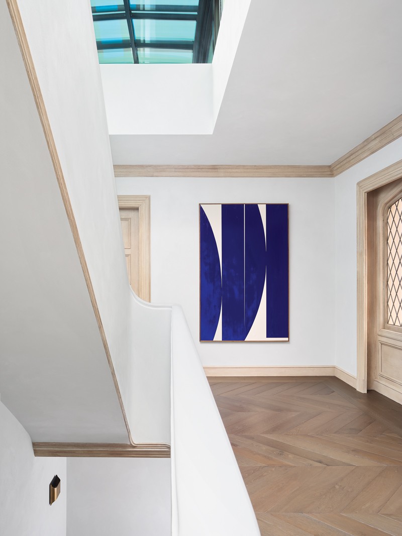
One of the first steps taken by the designer was to replace the original Tudor-style staircase with a brighter, more contemporary design in creamy white plaster. They also add a large skylight at the top that floods the previously moody space with natural light.
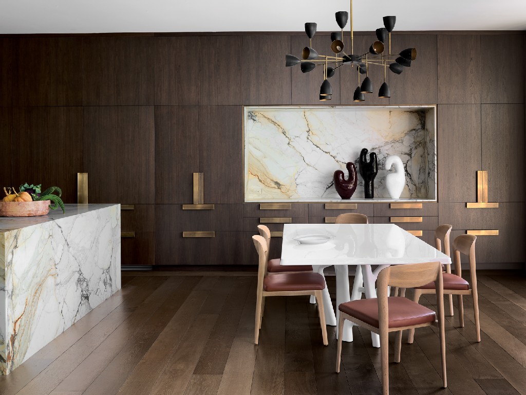
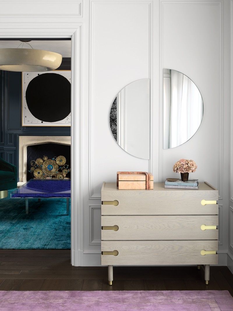
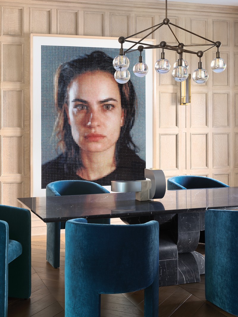
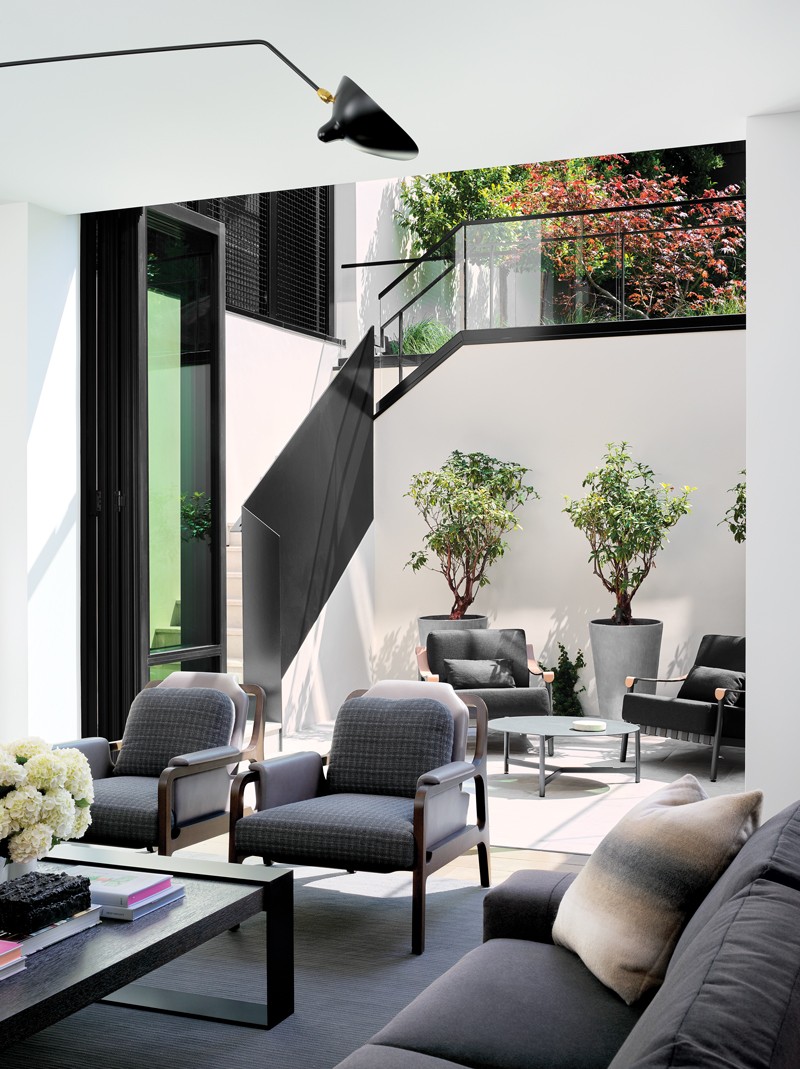
The home’s basement level, which had been an unlivable space, was rundown to construct a modern family room with ten-foot ceilings, guest suites, and a wine cellar. De Sousa kept the existing millwork in the living and dining rooms but sandblasted it to its natural hue, creating a lighter, fresher backdrop for contemporary artworks.
He also prioritized chandeliers and sconces, such as the living room’s eye-catching asymmetrical branching fixture with brass and onyx lights.
For the furnishings, Geoffrey De Sousa used sculptural upholstered seating. A trio of robust pieces by French designer Charles Tassin occupies one end of the living room. At the same time, a curvy Vladimir Kagan mini-sofa joins an iconic Joe Colombo lounge chair near the fireplace at the other.
The clients have a bit of a modern French aesthetic from the ’40s to the ’80s, and those are pieces that they were attracted to. English Tudor is usually very heavy and dark, so the designer tried to marry that with furnishings that were lighter, curvier, and a little sexier.
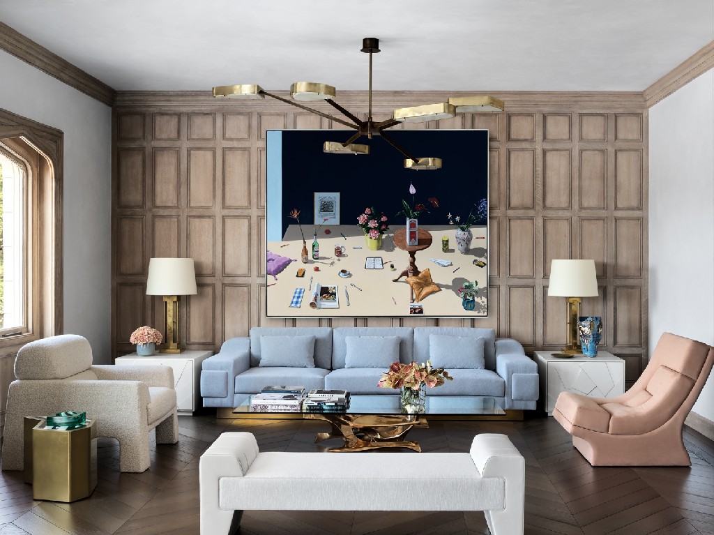
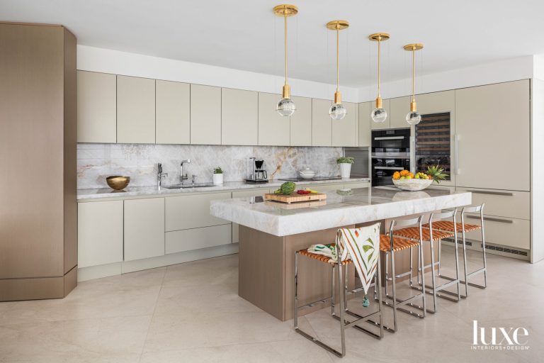
Not that he completely shied away from darker elements. De Sousa installed floor-to-ceiling chocolate walnut cabinetry in the open kitchen and informal dining area. It gave it a contemporary feel with clean, minimalist fronts adorned with oversized bronzed pulls.
He also ran into a deeper palette for the sitting area attached to the main bedroom, refinishing its wraparound paneling in a rich blue-gray lacquer. “I wanted the upholstery to be sumptuous,” says De Sousa. “Dark has such a negative connotation in a home. However, sometimes it is the nature of the space, and if you play that up, you can get something that’s super moody and sexy.”
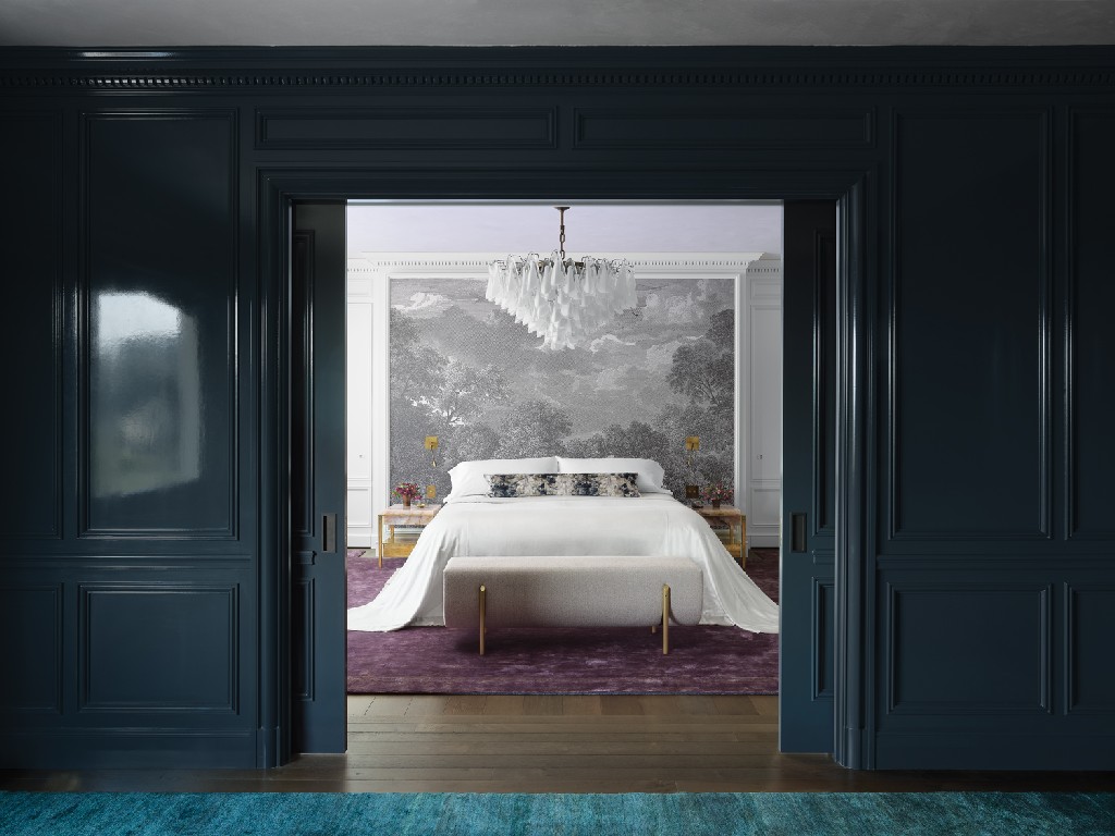
Paneled doors slide open to reveal the couple’s bed, dramatically set beneath a spectacular Murano glass chandelier and a custom-printed mural of an Arcadian landscape in striking grisaille that gives the space visual depth. De Sousa added bedside tables in pink quartz and brass and set everything on a grape-color carpet.
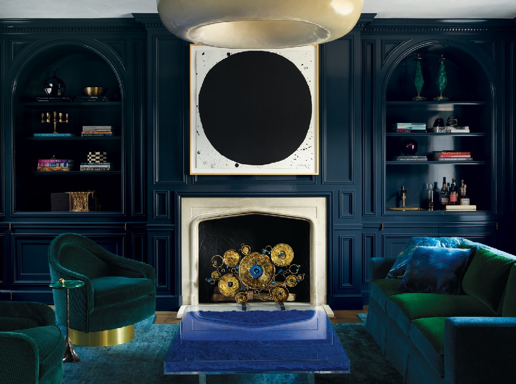
For Geoffrey De Sousa, the bedroom suite is the crown jewel of a project that involved reconsidering more architectural details than initially anticipated, from the new staircase and various creative updates to the abundant paneling. “When the clients recognized I was paying homage to the house but also making it steeped in today,” says De Sousa, “they allowed me to just run with it.”
Download the Hommés Studio catalog and discover furniture, lighting, and home accessories to design a modern and sculptural interior. Pay a visit to ACH Collection website as well and discover high-end homeware and pet accessories for a wholesome modern lifestyle.

